The average med spa website converts 2-3% of visitors into booked appointments. Top-performing sites convert at 8-12%. On 5,000 monthly visitors, that gap is worth $150,000 or more in monthly revenue.
Your website is not a digital brochure. When it comes to med spa web design, it is the most important employee at your practice — working 24/7, handling more patient interactions than your entire front desk team combined. And most med spa websites are terrible at the job.
This is the definitive guide to medical spa website design that actually converts visitors into booked patients. Not trends. Not opinions. Data-backed design principles, UX patterns, and conversion elements that move visitors from browsing to booking. Every recommendation here comes from analyzing hundreds of med spa websites and the conversion data behind them.
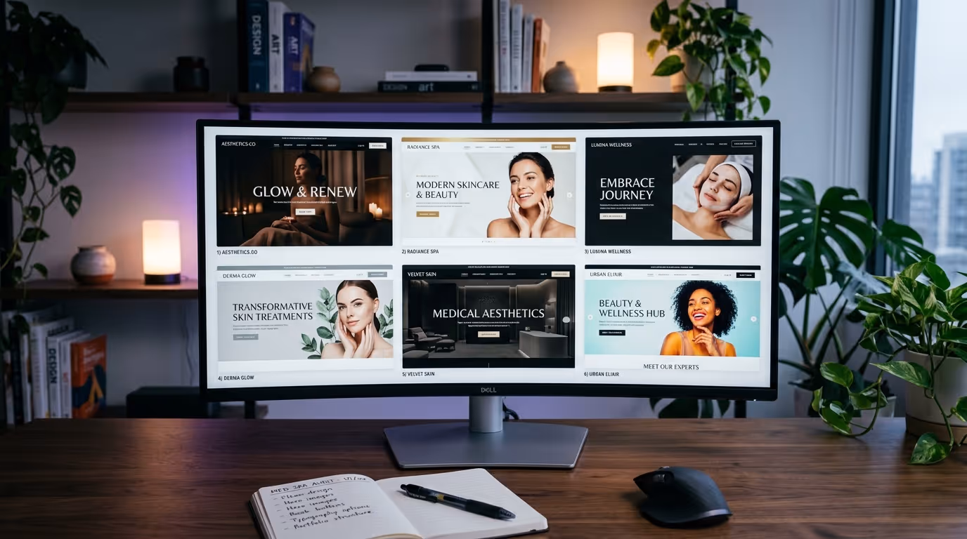
If you want to see real-world examples of what works, pair this guide with our breakdown of the best med spa websites in 2026.
The Revenue Impact of Website Design
Before we get into specific design elements, let's quantify what's at stake. Most med spa owners think of their website as a cost center. It is actually your highest-leverage revenue asset.
| Monthly Visitors | 2% Conversion (Average) | 8% Conversion (Top 10%) | Revenue Gap* |
|---|---|---|---|
| 1,000 | 20 leads | 80 leads | $45,000/mo |
| 3,000 | 60 leads | 240 leads | $135,000/mo |
| 5,000 | 100 leads | 400 leads | $225,000/mo |
| 10,000 | 200 leads | 800 leads | $450,000/mo |
*Assumes 25% lead-to-patient conversion and $750 average first treatment value.
A med spa website redesign costs $4,000-$15,000. The revenue difference between a 2% and 8% converting site, at just 3,000 monthly visitors, is $135,000 per month. The ROI is not weeks — it is days.
The Anatomy of a High-Converting Med Spa Homepage
Every high-converting med spa homepage follows a predictable structure. Not because designers lack creativity — because this sequence matches how patients make decisions.
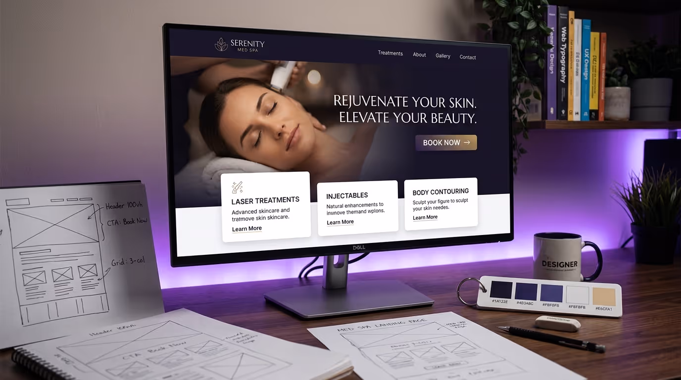
Above the Fold: The 3-Second Test
A visitor decides whether to stay or leave within 3 seconds. Your above-the-fold content must accomplish three things in that window:
- Communicate what you do — "Premier Medical Spa in [City]" beats clever taglines every time
- Establish credibility — Rating stars, review count, years in practice, or provider credentials
- Provide a clear next step — "Book a Consultation" button, visible and high-contrast
Implementation Steps
- Replace vague headlines ("Reveal Your Best Self") with specific positioning statements ("Board-Certified Aesthetic Treatments in [City]").
- Add a star rating + review count badge visible within the first viewport (e.g., "4.9 stars from 237 Google Reviews").
- Place a high-contrast CTA button above the fold. Use action language: "Book a Consultation" or "Schedule Your Visit."
- Use a high-quality image of your actual facility or a provider with a patient (with consent). Not stock photos.
- Set explicit image dimensions and use optimized formats (WebP/AVIF) to prevent layout shift.
What kills above-the-fold conversions:
- Auto-playing video backgrounds that slow load times (adds 2-4 seconds of LCP delay)
- Rotating carousels (the second and third slides get seen by less than 8% of visitors)
- Hero images without a CTA (beautiful but useless)
- Vague headlines that could apply to any wellness business
Common Mistakes
- Using a carousel. Data consistently shows carousels reduce conversion rates by 15-25% compared to a single static hero. Kill the carousel.
- Prioritizing aesthetics over clarity. A stunning full-screen video that takes 5 seconds to load loses 35% of visitors before they see anything.
- Missing the phone number. 34% of med spa bookings come by phone. If your number isn't in the header, you're losing a third of potential bookings.
Trust Signals: Rows 2-3
Immediately below the hero, establish trust before asking for anything:
- Review bar: Google rating + review count + Yelp rating. Link to full reviews.
- Credentials bar: Board certifications, accreditations, association memberships. Logos, not text.
- Media bar (if applicable): "As seen in" logos for media mentions. Only include if genuine.
Implementation Steps
- Embed live Google review ratings using a review widget (BirdEye, Grade.us, or custom API).
- Display certification and association logos as a horizontal bar (AmSpa, ASLMS, state medical boards).
- Keep this section compact — one or two rows maximum. The goal is not to impress; it is to remove doubt.
- Make review ratings clickable — link to your Google Business Profile or a dedicated reviews page.
Services Overview: The Visual Menu
Patients want to see what you offer quickly. The most effective format is a grid of treatment category cards:
- 6-8 categories maximum on the homepage (Injectables, Laser Treatments, Body Contouring, Skin Rejuvenation, etc.)
- Each card: treatment photo, category name, 1-line description, "Learn More" link
- Cards link to category pages, not individual treatment pages (reduce choice overload)
Implementation Steps
- Select your 6-8 highest-revenue treatment categories.
- Create consistent card designs with equal visual weight.
- Use real treatment or result photos, not icons.
- Write one-line descriptions focused on patient outcomes, not technical specifications.
- Link each card to its category pillar page.
- Add hover states that expand detail without leaving the page.
Do not list every treatment on the homepage. A wall of 30 treatment names creates decision paralysis. Guide patients to categories, then let treatment pages do the detailed selling.
Results Section: Before and After
Nothing converts like visual proof. A before-and-after gallery preview on your homepage should include:
- 4-6 of your best results across different treatment categories
- Consistent photo quality (lighting, angles, backgrounds)
- Treatment name and brief description below each pair
- Link to full gallery for each treatment category
- HIPAA-compliant consent documentation behind the scenes
Conversion data: Med spa homepages with before-and-after galleries convert at 2.3x the rate of those without. This is the single highest-impact design element you can add. For photography standards and consent protocols, see our med spa photography guide.
Implementation Steps
- Select your 4-6 most impressive, diverse before/after results.
- Ensure all photos use standardized conditions (same lighting, angle, distance, background).
- Add treatment labels and brief context (treatment type, number of sessions).
- Include appropriate disclaimers ("Results may vary. Individual results not guaranteed.").
- Link to treatment-specific full galleries.
- Implement a swipe/slider interaction for mobile viewing.
Provider Section
Patients choose providers, not practices. Feature your top providers with:
- Professional headshots (not casual photos)
- Name, title, and key credentials (board certifications, years of experience)
- Specialization or signature treatments
- Link to full bio page with E-E-A-T signals
Implementation Steps
- Limit homepage display to 2-4 providers.
- Use consistent, professional headshot styling.
- Highlight the single most impressive credential per provider.
- Include a brief statement of specialization.
- Link to full provider pages that include detailed bios, published work, and schema markup.
Testimonials and Social Proof
Patient testimonials should appear in the lower third of the homepage. By this point, visitors have seen your services, results, and team. Testimonials confirm their growing interest.
Effective testimonial formats:
- Video testimonials (40% higher engagement than text)
- Text testimonials with patient first name, treatment received, and photo (with consent)
- Google review embeds with verified badges
Avoid: Anonymous testimonials ("- Happy Patient"), testimonials without treatment context, or excessive testimonials that create scroll fatigue.
Implementation Steps
- Collect 5-10 patient testimonials with signed consent for website use.
- Include treatment context in every testimonial (what they got, why they chose you).
- Embed 2-3 video testimonials if available (auto-play off, click-to-play).
- Use a Google review embed widget for authentic, verifiable social proof.
- Rotate testimonials to keep content fresh.
Final CTA: The Close
The bottom of your homepage should have a strong closing CTA section:
- Headline that addresses the main objection ("Not Sure Which Treatment Is Right for You?")
- Brief reassurance copy (free consultation, no obligation, personalized plan)
- Primary CTA button (Book a Consultation)
- Secondary option (Take Our Treatment Quiz, Call Us, Download a Guide)
This section catches the 60% of visitors who scroll the full page but do not click a CTA along the way.
Treatment Page Design: Where Conversions Actually Happen
Your homepage gets the most traffic, but your treatment pages close the most bookings. These pages deserve more design attention than most med spas give them.
The High-Converting Treatment Page Template
Every treatment page should follow this structure. This template is what top-performing med spa websites use, and it is what Google rewards for YMYL content.
1. Hero section
- Treatment name as H1
- 1-2 sentence positioning statement
- Primary CTA button
- Hero image (treatment being performed or result photo)
2. Overview section (200-300 words)
- What the treatment is and what it does
- Who it is for (ideal candidate profile)
- Key differentiators vs alternatives
3. Before-and-after gallery
- 4-8 results specific to this treatment
- Filterable by treatment area if applicable
- Consistent photo standards
4. How it works (150-200 words)
- Step-by-step procedure walkthrough
- What to expect during the appointment
- Duration and comfort level
5. Candidacy checklist
- Bulleted list: "You may be a good candidate if..."
- Bulleted list: "This treatment may not be right for you if..."
- This self-qualification step reduces no-shows by 15-20%
6. Results and recovery
- Expected timeline for results
- Recovery period and aftercare
- Longevity and maintenance requirements
7. Pricing
- Starting price or price range
- What is included (consultation, follow-up, etc.)
- Financing options with monthly payment examples
- Link to your pricing strategy or financing page
8. FAQ section
- 6-10 frequently asked questions
- Implement FAQPage schema markup for rich results
- Answer the questions patients actually ask, not the ones you wish they would ask
9. Provider credentials
- Who performs this treatment at your practice
- Relevant training and certifications
- Experience volume ("Over 5,000 Botox treatments performed")
10. CTA section
- Booking widget or button
- Phone number with tap-to-call
- Chat option for questions
Total content length: 800-1,500 words. This is not excessive — it is what Google requires to rank treatment pages competitively, and it is what patients need to feel confident booking.
Common Treatment Page Mistakes
- No pricing information. The number one thing patients search for is cost. If they can't find it, they bounce to the next practice that shows it.
- Missing before/after photos. Treatment pages without visual proof convert at half the rate of those with photos.
- Generic FAQs. "Is this treatment safe?" is lazy. "Can I get Botox if I'm pregnant?" is specific and useful.
- No CTA between sections. Don't make patients scroll to the bottom to book. Add a floating CTA or inline booking prompts every 2-3 sections.
- Thin content. A 200-word treatment page will not rank and will not convert. Invest in comprehensive treatment pages.
Service Page Design: The Page Type Most Med Spas Get Wrong
Between your homepage and individual treatment pages, you need service category pages (also called service pillar pages). These pages capture searches like "injectable treatments in [City]" or "laser treatments near me."
Implementation Steps
- Create one service page per major treatment category.
- Write 1,500-2,500 words covering all treatments in that category.
- Link to each individual treatment page within the content.
- Include a comparison table of treatments within the category.
- Add a consultation CTA specific to that service line.
- Optimize for "[Category] in [City]" keywords.
Service Page Content Structure
| Section | Content | Length |
|---|---|---|
| Hero + introduction | Category overview, who it's for | 150-200 words |
| Treatment comparison table | All treatments in category compared | Table + 200 words |
| Individual treatment summaries | Brief overview of each, linking to full pages | 100-150 words each |
| Who is a candidate | General candidacy for this category | 100-150 words |
| Why choose us | Provider credentials, technology, results | 150-200 words |
| FAQ section | 8-12 category-level FAQs | 400-600 words |
| CTA | Consultation booking | 50-75 words |
Mobile-First Design Requirements
Over 72% of med spa website traffic comes from mobile devices. Yet most med spa sites are designed on desktop and "made responsive" as an afterthought. That is backwards.
Mobile-First Principles for Med Spas
Navigation:
- Hamburger menu with treatment categories as top-level items
- Persistent "Book Now" button in the mobile header (always visible)
- Tap-to-call button accessible from every page
- Maximum 3 taps from any page to booking confirmation
Content layout:
- Single-column layout below 768px (no side-by-side content that requires horizontal scrolling)
- Touch targets minimum 44x44 pixels (Apple's guideline — anything smaller causes mis-taps)
- Form fields use appropriate input types (tel for phone, email for email) to trigger correct mobile keyboards
- Before-and-after images use a swipe slider, not side-by-side comparison
Performance:
- Total page weight under 2MB on mobile
- Lazy load all images below the fold
- Use WebP or AVIF image formats (40-60% smaller than JPEG)
- Defer non-critical JavaScript until after initial render
Implementation Steps
- Audit your site on real devices. Browser resize is not the same as mobile testing. Use actual iPhones and Android phones.
- Test booking flow on mobile. Book a fake appointment on your phone. Count the taps, note the friction points.
- Add persistent mobile CTA. A sticky header or floating button that stays visible as users scroll.
- Optimize tap-to-call. Phone number should be a clickable link on every page, formatted for mobile dialing.
- Compress and convert images. Use Squoosh or ShortPixel. Target under 200KB for hero images, under 100KB for gallery thumbnails.
- Test load speed on 4G connection. Not everyone has WiFi. Your site needs to load fast on cellular data.
Mobile vs Desktop Conversion Benchmarks
| Metric | Desktop | Mobile | Gap |
|---|---|---|---|
| Average conversion rate | 3.2% | 1.4% | -56% |
| Top 10% conversion rate | 8.1% | 4.8% | -41% |
| Avg session duration | 3:45 | 1:42 | -55% |
| Bounce rate | 41% | 62% | +51% |
The mobile conversion gap represents your biggest optimization opportunity. Closing this gap by even 50% dramatically increases total conversion volume.
See our mobile design guide for the complete mobile optimization playbook.
Page Speed Optimization
Page speed is a direct ranking factor and a proven conversion factor. Every additional second of load time reduces conversions by 7%.
| Load Time | Expected Conversion Impact |
|---|---|
| Under 2 seconds | Baseline (optimal) |
| 2-3 seconds | -7% conversions |
| 3-4 seconds | -15% conversions |
| 4-5 seconds | -25% conversions |
| 5+ seconds | -35%+ conversions |
Critical Optimizations
Implementation Steps
- Image compression. Use Squoosh, ShortPixel, or Cloudflare Image Optimization. Target under 200KB for hero images, under 100KB for gallery thumbnails. Convert to WebP or AVIF.
- Font loading. Use
font-display: swapand limit to 2-3 font families maximum. Self-host fonts instead of loading from Google Fonts CDN. - Third-party script audit. Review every script on your site. Chat widgets, analytics, booking tools, and review widgets add up fast. Defer or async everything possible.
- Hosting upgrade. Medical spa websites do not need enterprise hosting, but they need better than $5/month shared hosting. Use a managed WordPress host, Webflow, or a platform with built-in CDN.
- Critical CSS inlining. Inline the CSS needed for above-the-fold content to eliminate render-blocking stylesheets.
- Database optimization. If using WordPress, optimize the database and remove unused plugins. Each active plugin adds load time.
Core Web Vitals targets for med spas:
- LCP (Largest Contentful Paint): Under 2.5 seconds
- INP (Interaction to Next Paint): Under 200ms
- CLS (Cumulative Layout Shift): Under 0.1
For the complete website optimization checklist, including step-by-step speed fixes and testing protocols, see our dedicated guide.
Booking Integration Best Practices
Your booking system is the finish line. A clunky integration at this stage wastes every design dollar you spent getting patients there.
What works:
- Embedded booking widget on treatment pages (not a redirect to a third-party site)
- Pre-populated treatment selection based on the page the patient is on
- Minimal required fields for initial booking (name, email, phone, preferred time)
- Mobile-friendly date/time picker
- Instant confirmation via email and SMS
- Calendar integration options (Add to Google Calendar, Add to Apple Calendar)
What kills bookings:
- Forcing account creation before booking
- Redirecting to a separate booking URL that looks different from your site
- Requiring a deposit for consultation bookings
- Forms with 10+ required fields
- No confirmation message or email after submission
Implementation Steps
- Choose a booking platform that offers embeddable widgets (Mangomint, Boulevard, Vagaro, or GoHighLevel).
- Embed the booking widget directly on treatment pages — do not redirect to a separate URL.
- Pre-populate the treatment field based on which page the patient is viewing.
- Reduce form fields to the minimum: name, phone, email, preferred treatment, preferred date/time.
- Set up instant confirmation via SMS and email.
- Add appointment reminder sequences: 48-hour, 24-hour, and 2-hour reminders.
- Test the complete booking flow monthly on mobile and desktop.
Photography Guidelines for Med Spas
Photography quality is the single biggest differentiator between med spa websites that feel premium and those that feel generic. Stock photos are a conversion killer in this industry.
What to Shoot
Must-have photography:
- Facility exterior (clean, well-lit, inviting entrance)
- Lobby and waiting area
- Treatment rooms (at least 2-3 angles)
- Provider headshots (professional, consistent backdrop)
- Provider performing treatments (with patient consent)
- Before-and-after results (standardized conditions)
Nice-to-have photography:
- Team group photo
- Behind-the-scenes preparation
- Product displays
- Lifestyle shots in your neighborhood/area
Photography Standards
- Lighting: Natural light or professional studio lighting. Never overhead fluorescent.
- Consistency: Same photographer, same editing style across all images. This creates visual cohesion.
- Resolution: Shoot at highest resolution, then export web-optimized versions. You want the source files for print and future use.
- Consent: Every patient photo requires signed authorization specifically granting website use. Store consent forms securely.
Budget expectation: A professional med spa photo shoot (half day, 100-150 edited images) costs $1,500-$3,000. It is the highest-ROI investment in your website redesign.
For the complete photography guide with shot lists, consent templates, and editing standards, see our dedicated resource.
Color Psychology for Med Spas
Color choices in medical spa website design are not arbitrary. They communicate brand positioning and influence patient perception.
Most effective primary color families:
| Color Family | Psychology | Best For |
|---|---|---|
| Navy/Dark Blue | Trust, authority, medical credibility | Physician-led practices, clinical positioning |
| Teal/Seafoam | Calm, renewal, wellness | Holistic or wellness-focused med spas |
| Soft Gold/Champagne | Luxury, exclusivity, premium | High-end boutique practices |
| Deep Purple | Sophistication, transformation | Anti-aging and rejuvenation focus |
| Warm White/Cream | Clean, pure, clinical | Minimalist, modern practices |
Colors to avoid as primary:
- Bright red (anxiety, urgency — wrong emotion for aesthetic decisions)
- Neon green (cheap, discount associations)
- Hot pink (salon associations, undermines medical credibility)
- Black as a dominant color (funereal, oppressive — fine as an accent)
The CTA color rule: Your CTA buttons should use a color that does not appear anywhere else on the page. This creates visual contrast that draws the eye. Orange and coral CTAs consistently outperform other colors in med spa conversion tests.
For more on visual identity and med spa branding, including how color systems work across digital and physical touchpoints, see our branding resource.
Common Medical Spa Website Design Mistakes That Kill Conversions
After auditing hundreds of med spa websites, these are the medical spa website design mistakes we see most often — and their measurable impact on performance.
1. The Homepage Carousel
Rotating hero carousels look dynamic but perform terribly. Data consistently shows that less than 8% of visitors interact with slides beyond the first. The animation delays content consumption, confuses the page hierarchy, and often slows page load.
Fix: Replace with a single, static hero section with one clear message and one CTA. Conversion lift: 15-25%.
2. No Visible Phone Number
34% of med spa appointments are still booked by phone. If your phone number is buried in the footer or hidden behind a "Contact" link, you are losing a third of your potential bookings.
Fix: Phone number in the header, tap-to-call on mobile, visible on every page.
3. Stock Photography Everywhere
Patients can spot stock photos instantly. A website full of stock models tells visitors: "We do not have real results to show you." This destroys trust for a business built on visual outcomes.
Fix: Invest in one professional photo shoot. Replace stock photos incrementally if budget is limited — start with the homepage and top 5 treatment pages. See our med spa design ideas for visual inspiration.
4. Contact Form Instead of Booking Widget
A contact form says "Submit your information and we will get back to you eventually." A booking widget says "Pick a time and you are confirmed." The difference in conversion rate is 3-5x.
Fix: Implement a real booking system with available time slots. Even if you need to confirm manually, give patients the experience of booking, not just submitting a request.
5. Missing Pricing Information
The number one thing patients search for is pricing. If they cannot find it on your site, they go to the next one. The fear that showing prices will scare patients away is a myth — it actually pre-qualifies visitors and increases booking quality.
Fix: Show pricing ranges at minimum. "Botox: Starting at $12/unit" is better than nothing. Include financing options to offset sticker shock on high-ticket treatments. For guidance on what to display, see our med spa pricing strategy guide.
6. Ignoring Page Speed
A website that takes 5+ seconds to load on mobile loses 35% of visitors before they see a single word of content. Heavy images, unoptimized code, and cheap hosting are the usual culprits.
Fix: Run Google PageSpeed Insights today. Target a mobile score of 80+. Address the top 3 recommendations first — they typically deliver 80% of the improvement.
7. No Clear Visual Hierarchy
When everything is bold, nothing is bold. Med spa websites that try to highlight every treatment, every promotion, and every provider on the homepage create visual chaos that paralyzes decision-making.
Fix: One primary CTA per page. One featured treatment or promotion at the top. Visual hierarchy guides the eye from most important to least important — do not make patients figure out where to look.
8. No Internal Linking Strategy
Pages that exist in isolation are invisible to both Google and patients. Your homepage design should connect to category pages, which connect to treatment pages, which connect to blog content.
Fix: Build a deliberate internal linking structure. Every page should link to 5-10 related pages. Use descriptive anchor text (not "click here").
Website Platform Recommendations for Med Spas
Choosing the right platform affects both design capabilities and long-term maintenance costs.
| Platform | Best For | Monthly Cost | Design Flexibility | SEO Capability |
|---|---|---|---|---|
| Webflow | Custom design, scalability | $29-$49 | Excellent | Excellent |
| WordPress + Divi/Elementor | Budget-friendly, plugin ecosystem | $10-$50 + hosting | Good | Good |
| Squarespace | Simple, template-based | $16-$33 | Moderate | Moderate |
| Custom build | Enterprise, multi-location | $200+ | Unlimited | Unlimited |
For a detailed comparison of platforms, their strengths, and their limitations for medical aesthetics websites, read our Webflow vs WordPress comparison.
Medical Spa Website Design Benchmarks: Where Do You Stand?
Here is how to benchmark your medical spa website design performance against the industry:
| Metric | Industry Average | Top 10% | Elite (Top 1%) |
|---|---|---|---|
| Website conversion rate (visitor to booking) | 2.1% | 6.5% | 11.2% |
| Mobile conversion rate | 1.4% | 4.8% | 8.7% |
| Treatment page bounce rate | 62% | 38% | 24% |
| Average session duration | 1:42 | 3:15 | 5:30+ |
| Pages per session | 2.1 | 3.8 | 5.2 |
| Return visitor rate | 18% | 32% | 45% |
| Form completion rate | 12% | 28% | 42% |
If your numbers fall below the industry average, your website is actively costing you patients. The gap between average and top 10% is almost entirely explained by the design principles covered in this guide — not by ad spend, brand awareness, or market size.
The Website Redesign Checklist
Before you redesign or audit your current site, run through this checklist. Every item directly impacts conversion rates.
Non-negotiables:
- [ ] Mobile-first responsive design (test on actual devices, not just browser resize)
- [ ] Page speed under 3 seconds on mobile (test with PageSpeed Insights)
- [ ] SSL certificate (HTTPS) active and properly configured
- [ ] HIPAA-compliant forms and data handling
- [ ] Online booking integration (not just a contact form)
- [ ] Google Business Profile linked and optimized (optimization guide)
- [ ] Individual treatment pages (not bundled service categories)
- [ ] Real photography (at minimum: facility, providers, results)
- [ ] Provider bios with credentials
- [ ] NAP consistency across all pages
High-impact optimizations:
- [ ] Before-and-after gallery with consent documentation
- [ ] Treatment comparison pages for competing services
- [ ] Pricing information (ranges are fine if exact pricing is not possible)
- [ ] Video content on treatment pages
- [ ] Treatment quiz or assessment tool
- [ ] Financing integration (Cherry, PatientFi, Alphaeon, CareCredit)
- [ ] SMS booking confirmation
- [ ] Exit-intent lead capture
- [ ] Schema markup (MedicalBusiness, MedicalProcedure, FAQPage)
- [ ] Blog with content cluster strategy
Conversion accelerators:
- [ ] Contextual CTAs that adapt to page content
- [ ] Candidacy checklist on treatment pages
- [ ] Live chat or chatbot during business hours
- [ ] Review integration showing Google/Yelp ratings
- [ ] Urgency elements (limited availability, seasonal promotions)
- [ ] Retargeting pixel installed (Meta, Google)
The Bottom Line
Great medical spa website design is not about aesthetics for aesthetics' sake. It is about building a conversion engine that turns anonymous visitors into booked patients, systematically and predictably.
The practices that dominate their markets in 2026 share a common thread: they treat medspa web design as their most important revenue-generating asset and invest in it accordingly. Not with annual redesigns, but with continuous, data-informed optimization of every element that touches the patient journey.
Start with the homepage structure. Fix the treatment pages. Get the photography right. Optimize for mobile. Measure everything. And if you want to know exactly where the website mistakes are costing you patients, we can show you.
Your website should be your hardest-working employee. If it is not pulling its weight, book a strategy call and we will show you exactly where the revenue is leaking — and what to fix first, second, and third to close the gap.
Related reading:
- Best Med Spa Websites: 20 Examples That Convert
- Med Spa Homepage Design: 12 Elements That Convert
- Med Spa Service Page Design: Templates That Book Patients
- How Much Does a Med Spa Website Cost?
- Med Spa Website Mistakes That Cost You Patients
- SEO for Medical Spas: Why Most Agencies Get It Wrong
- Med Spa Marketing Strategies: The Definitive Guide