
Your med spa mobile design could be the reason patients are choosing your competitor. Pull out your phone right now. Open your med spa's website. Try to book an appointment.
How was that experience? Were you pinching and zooming? Did the text overlap? Did the booking form require a magnifying glass? Did the page take forever to load?
If your answer is anything other than "it was fast, clean, and I could book in under 30 seconds," you have a problem that is costing you patients every single day.
Here is the number that should change how you think about your website: 72% of med spa website traffic comes from mobile devices. Not desktop. Not tablets. Phones. And that number is increasing every year.
Yet the majority of med spa websites we audit were designed desktop-first — meaning someone built a beautiful site on a large monitor and then tried to squeeze it onto a phone screen as an afterthought. The result is a mobile experience that is clunky, slow, and frustrating enough to send potential patients to your competitor.
This guide breaks down why med spa mobile design is non-negotiable, what it actually means at a technical and strategic level, the specific design principles that convert mobile visitors into booked patients, and how to fix the most common med spa mobile design problems we see across hundreds of websites.
The Med Spa Mobile Design Reality
Let us start with the data, because too many practice owners are making decisions based on how they personally browse the internet (on a desktop in their office) rather than how their patients actually find them.
The Numbers That Matter
| Metric | Data Point | Source/Context |
|---|---|---|
| Mobile traffic share | 72% of med spa visitors | Industry average across 100+ sites audited |
| Mobile abandonment | 53% leave if load time exceeds 3 seconds | Google research |
| Local mobile searches | 88% result in a call or visit within 24 hours | Google/Ipsos |
| Return visitors | 61% will not return after a bad mobile experience | Google research |
| Google indexing | Mobile-first indexing is now the default | All sites since 2021 |
| Mobile booking | 65% of med spa bookings originate on mobile | CRM data across practices |
| Mobile form abandonment | 67% abandon forms that are hard to use on mobile | Baymard Institute |
What This Means for Your Practice
Your med spa mobile website is not a secondary version of your "real" website. For the majority of your potential patients, it IS your website. They will never see your desktop site. They will judge your entire practice based on how it looks and functions on a 6-inch screen.
Think about when potential patients are searching for your services:
- They are scrolling Instagram and see a friend's Botox results — they search "Botox near me" on their phone
- They are in a waiting room and notice a magazine article about CoolSculpting — they search it on their phone
- They are having a conversation at brunch about lip fillers — they look up local options on their phone
- They receive a referral text from a friend — they click the link on their phone
The moment of interest and the moment of action are the same — and they happen on mobile. If your website fumbles that moment, you have lost the patient before they ever knew your name.
The Revenue Impact of Poor Mobile Design
| Problem | Percentage of Mobile Visitors Affected | Revenue Lost per 1,000 Visitors |
|---|---|---|
| Page load over 3 seconds | 53% abandon | 530 visitors x 5% conversion x $400 ATV = $10,600 |
| Difficult booking process | 40% abandon booking | 200 intent visitors x 40% abandon = 80 lost bookings x $400 = $32,000 |
| Unreadable text/poor layout | 30% leave immediately | 300 visitors x 5% conversion x $400 = $6,000 |
| No visible phone number | 25% who want to call cannot | 250 callers x 30% would book x $400 = $30,000 |
For a med spa getting 3,000 mobile visitors per month, poor mobile design could be costing $50,000 to $100,000 or more in lost annual revenue. That dwarfs any investment in medical spa mobile optimization.
What Mobile-First Design Actually Means
There is a critical distinction between a "mobile-responsive" website and a "mobile-first" website, and most med spas have the wrong one.
Mobile-Responsive (What Most Med Spas Have)
A responsive website is designed for desktop and then adapted to fit smaller screens. The content reflows, images resize, and elements stack vertically instead of sitting side by side. It technically works on mobile — but it was not designed for mobile.
Common Problems with Responsive-But-Not-Mobile-First Sites:
| Problem | User Impact | Conversion Impact |
|---|---|---|
| Desktop navigation crammed into hamburger | Overwhelming, hard to find things | -15-25% engagement |
| Text too small or too large after scaling | Hard to read, unprofessional | -20-30% time on page |
| Buttons too close together | Accidental taps, frustration | -10-20% action completion |
| Desktop-resolution images | Slow load times on mobile | -53% visitors if over 3 seconds |
| Tiny form fields | Hard to complete on phone | -67% form abandonment |
| Content hierarchy wrong for vertical scroll | Important info buried below fold | -30% conversion |
Mobile-First (What Your Med Spa Needs)
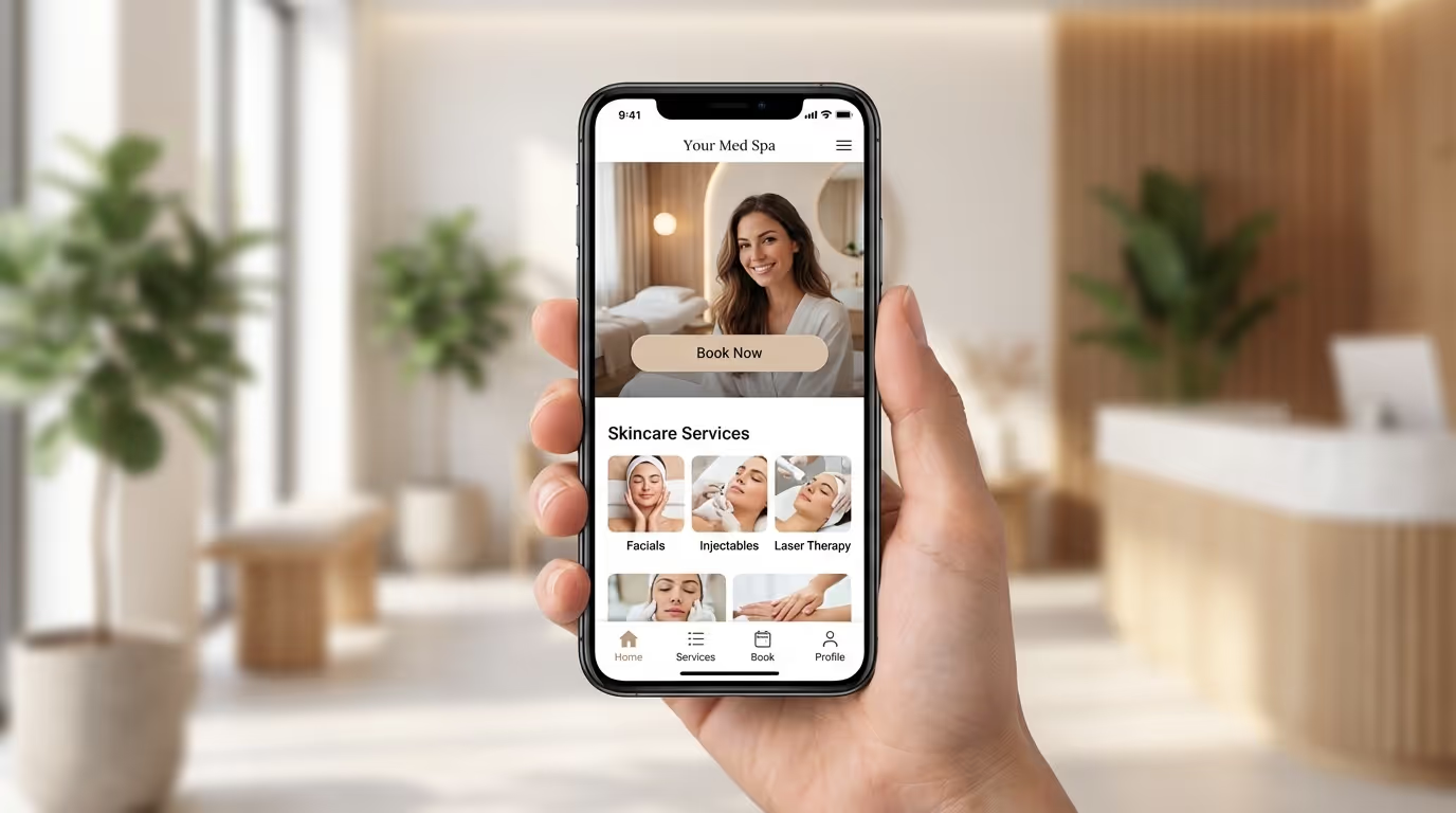
A mobile-first website is designed for the phone screen first and then enhanced for larger screens. Every design decision starts with the question: "How does this work on a phone?"
The Difference Shows Up In:
| Element | Mobile-Responsive | Mobile-First |
|---|---|---|
| Navigation | Desktop menu squeezed into mobile | Designed for thumb reach and one-handed use |
| Content order | Desktop order stacked vertically | Optimized for vertical scrolling priority |
| Tap targets | Mouse-sized, too close together | 44x44px minimum, well-spaced |
| Images | Desktop images scaled down | Optimized, lazy-loaded, mobile-specific crops |
| Forms | Desktop fields shrunk | Minimal fields, mobile keyboards, autofill |
| Page speed | Desktop assets served to mobile | Mobile-optimized assets, aggressive caching |
| CTAs | Desktop buttons repositioned | Sticky headers, floating buttons, thumb-zone placement |
Google uses mobile-first indexing — meaning it evaluates your site based on the mobile version. If your mobile experience is inferior to your desktop experience, your SEO rankings suffer regardless of how good the desktop site looks.
The 12 Principles of Mobile-First Med Spa Design
Principle 1: Speed Is Not a Feature — It Is THE Feature
If your mobile site takes more than 3 seconds to load, you lose 53% of visitors before they see a single word of content. For a med spa getting 2,000 mobile visitors per month, that is 1,060 people who never even see your homepage.
Implementation Steps:
- Compress all images to WebP format (80% smaller than JPEG with no visible quality loss)
- Implement lazy loading so below-the-fold images load only when scrolled to
- Minimize CSS and JavaScript files — remove unused code
- Use a CDN (content delivery network) for faster asset delivery
- Target a Largest Contentful Paint (LCP) under 2.5 seconds
- Test regularly with Google PageSpeed Insights — aim for a mobile score of 80+
- Remove or defer non-essential third-party scripts (chat widgets, analytics tags)
- Enable browser caching for returning visitors
Speed Benchmarks:
| Metric | Poor | Needs Work | Good | Excellent |
|---|---|---|---|---|
| Mobile PageSpeed score | Below 40 | 40-65 | 65-85 | 85+ |
| LCP | Over 4.0s | 2.5-4.0s | 1.5-2.5s | Under 1.5s |
| Total page size | Over 5MB | 3-5MB | 1-3MB | Under 1MB |
| Time to Interactive | Over 7s | 5-7s | 3-5s | Under 3s |
Principle 2: Three-Tap Booking Rule
A patient on mobile should be able to get from any page on your website to a confirmed booking in three taps or fewer. Anything more and you are adding friction that costs you conversions.
Implementation Steps:
- Add a sticky "Book Now" button in the header that follows users as they scroll
- Include a click-to-call phone number prominently in the header
- Use a hamburger menu with clear category labels ("Services" not "Transformations")
- Limit main navigation to 5-7 items maximum
- Add breadcrumbs so users always know where they are
- Place booking CTAs at the top and bottom of every page
- Consider a floating action button (FAB) for booking on treatment pages
Common Mistake: Using clever or creative navigation labels. "Services" is clear. "Your Journey" is confusing. "Transformations" is ambiguous. On mobile, clarity beats creativity every time.
Principle 3: Design for Thumbs, Not Cursors
The average adult thumb can comfortably reach about 50% of a phone screen when held one-handed. Your most important actions — booking, calling, navigating — should fall within that thumb zone.
Implementation Steps:
- Place primary CTAs in the lower third of the screen or in a sticky bottom bar
- Make all buttons at least 44x44 pixels (Apple's minimum recommended tap target)
- Add adequate spacing between clickable elements (at least 8px between tap targets)
- Avoid hover-dependent interactions (there is no hover on mobile)
- Test your site by actually using it one-handed on a phone
- Place the most important navigation actions in the bottom bar if using app-style navigation
Tap Target Specifications:
| Element | Minimum Size | Recommended Size | Minimum Spacing |
|---|---|---|---|
| Buttons | 44x44px | 48x48px | 8px |
| Links in text | 44px touch area | 48px touch area | 12px from other links |
| Navigation items | 44px height | 48-56px height | 8px |
| Form fields | 44px height | 48px height | 12px between fields |
Principle 4: Lead With the Action, Not the Story
On desktop, a patient might scroll through your about page, read your team bios, explore treatment details, and then book. On mobile, attention is compressed. They want to know three things immediately: what do you do, can you help me, and how do I book.
Implementation Steps:
- Put your value proposition, location, and primary CTA above the fold on mobile
- Use the first screen to answer: "What is this place and what should I do next?"
- Save detailed content for below the fold — interested patients will scroll
- Include a persistent booking mechanism (sticky header, floating button, or bottom bar)
- Front-load the most important information on every page
- Use expandable/accordion sections for detailed content that not everyone needs
Principle 5: Optimize Forms for Mobile Completion
If booking requires filling out a form, that form needs to be designed for thumbs on a phone screen. Most med spa booking forms were designed for desktop and are painful on mobile — which is why form abandonment on mobile averages 67%.
Implementation Steps:
- Reduce form fields to the absolute minimum (name, phone, treatment interest, preferred date)
- Use dropdown selectors instead of free-text fields where possible
- Enable autofill attributes so phones can auto-complete name, email, and phone
- Use the correct input types (
type="tel"for phone,type="email"for email) so the right keyboard appears - Make the submit button full-width and prominently styled
- Consider a two-step form (basic info first, details second) to reduce perceived complexity
- Show progress indicators on multi-step forms
- Add inline validation so errors are caught before submission
Form Field Recommendations:
| Field | Required? | Input Type | Mobile Optimization |
|---|---|---|---|
| First name | Yes | text | Autofill enabled |
| Phone number | Yes | tel | Numeric keyboard |
| Optional | Email keyboard | ||
| Treatment interest | Yes | Select dropdown | Native mobile picker |
| Preferred date | Optional | date | Native date picker |
| Message | No | Remove from mobile | Reduces friction |
Principle 6: Visual Hierarchy for Scanning
Mobile users scan. They do not read. Your mobile design needs to communicate through visual hierarchy — headlines, images, and whitespace — rather than dense paragraphs.
Implementation Steps:
- Use short headlines (5-8 words) that communicate the key message
- Break text into short paragraphs (2-3 sentences max on mobile)
- Use bullet points and numbered lists for scannable information
- Include high-quality images that communicate treatment results
- Add ample whitespace between sections — cramped content feels chaotic
- Use card-based layouts for treatment listings and provider profiles
- Make sure typography is readable at 16px minimum for body text
Principle 7: One-Tap Calling
For med spas, a phone call is often the highest-converting action a mobile visitor can take. Make it effortless.
Implementation Steps:
- Use click-to-call links on every phone number displayed
- Include a persistent phone icon in the header or navigation
- Add "Call Now" CTAs alongside "Book Online" options
- Display your phone number in the footer of every page
- Consider a floating call button for treatment and service pages
- Track all mobile calls with call tracking software to measure conversion
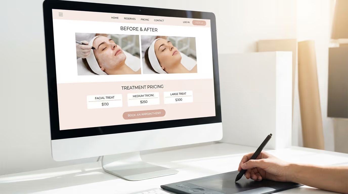
Principle 8: Mobile-Optimized Before-and-After Galleries
Before-and-after photos are the most powerful conversion tool in med spa marketing. But poorly implemented galleries on mobile — tiny thumbnails, slow-loading slideshows, pinch-to-zoom requirements — waste this asset.
Implementation Steps:
- Use swipeable, full-width image galleries optimized for mobile
- Display before-and-after images side by side at a size large enough to see detail
- Implement slider comparisons where users can drag to reveal the after image
- Lazy-load gallery images so they do not slow down initial page load
- Include treatment type and brief context text with each result
- Compress gallery images aggressively (target under 100KB per image)
- Consider a dedicated photography page optimized for mobile viewing
Principle 9: Mobile-Specific Trust Signals
Trust is critical for med spas — patients are trusting you with their appearance. On mobile, trust signals need to be visible without scrolling or searching.
Implementation Steps:
- Display Google review rating and count near the top of each page
- Include provider credentials (MD, NP, PA) prominently
- Show certification badges (AmSpa, board certifications)
- Feature patient testimonials with names and photos (with consent)
- Display "years in practice" or total procedures completed
- Include a brief security statement near forms
- Add "As Seen In" logos if you have media mentions
- Show real-time social proof ("127 patients treated this month")
Principle 10: Mobile-First Content Structure
The order of content on mobile matters differently than desktop. Information should follow the decision-making flow of a mobile user.
Recommended Mobile Content Order for Treatment Pages:
| Order | Content Block | Purpose |
|---|---|---|
| 1 | Treatment name + brief description (2-3 sentences) | Confirm relevance |
| 2 | Before-and-after photos (swipeable) | Build desire |
| 3 | Book Now / Call CTA | Capture ready buyers |
| 4 | Key benefits (bullet points) | Address motivations |
| 5 | Pricing or "starting at" range | Address price objection |
| 6 | Provider credentials | Build trust |
| 7 | FAQs (expandable) | Address remaining objections |
| 8 | Patient reviews/testimonials | Social proof |
| 9 | Related treatments | Cross-sell opportunity |
| 10 | Final CTA | Capture remaining interest |
Principle 11: Test on Real Devices
Chrome DevTools and responsive design simulators are useful but do not replicate the real experience of using a website on a phone.
Implementation Steps:
- Test on both iOS (iPhone) and Android (Samsung Galaxy, Google Pixel)
- Test on different screen sizes (standard phone, large phone, small phone)
- Test on different network conditions (WiFi, 4G, 3G)
- Have actual patients (not your team) test the booking flow and give feedback
- Test monthly — phone OS updates can change how your site renders
- Document issues with screenshots and prioritize fixes by conversion impact
Principle 12: Continuous Mobile Monitoring
Mobile optimization is not a one-time project. It requires ongoing monitoring and improvement.
Monthly Mobile Audit Checklist:
| Check | Tool | Target |
|---|---|---|
| PageSpeed mobile score | Google PageSpeed Insights | 80+ |
| Core Web Vitals | Google Search Console | All green |
| Mobile usability issues | Google Search Console | Zero issues |
| Form completion rate | GA4 | Above 30% |
| Mobile bounce rate | GA4 | Below 50% |
| Mobile conversion rate | GA4 | Above 3% |
| Average session duration (mobile) | GA4 | Above 2 minutes |
Common Med Spa Mobile Design Mistakes
Mistake 1: The Pop-Up Trap
Full-screen pop-ups that work fine on desktop become site-blocking nightmares on mobile. If a pop-up appears on mobile and the close button is tiny or hidden, the patient leaves. Google also penalizes intrusive interstitials on mobile — so this hurts both user experience and SEO.
Fix: If you use pop-ups, use them sparingly on mobile. Make the close button large and easy to tap. Better yet, use slide-in banners or bottom-bar notifications that do not obstruct content. Never show pop-ups before the user has engaged with at least one page.
Mistake 2: The Mega-Image Problem
That stunning hero image that looks incredible on a 27-inch monitor? On mobile, it pushes all content below the fold, takes 4 seconds to load, and the text overlay is unreadable. Beautiful on desktop. Disastrous on mobile.
Fix: Use different, optimized images for mobile. Crop for vertical orientation. Reduce file size aggressively. Consider using a solid color or gradient background with text on mobile instead of a large image. Target hero images under 150KB on mobile.
Mistake 3: The Desktop Menu Crammed Into a Hamburger
If your desktop navigation has 15+ items across multiple dropdown levels, stuffing all of that into a hamburger menu creates a confusing, overwhelming experience on mobile.
Fix: Simplify your mobile navigation. Group items into clear categories. Use progressive disclosure (tap to expand sections). Put your most important pages (Services, Book Now, Contact) at the top. Consider a bottom navigation bar for the most critical actions.
Mistake 4: The Forgotten Footer
On desktop, your footer has your address, phone number, hours, quick links, and social icons — all visible at a glance. On mobile, that same footer becomes a massive block of stacked text.
Fix: Restructure your mobile footer with expandable sections. Put the essentials (phone, address, hours) at the top. Use accordion-style menus for link categories. Keep it functional, not cluttered.
Mistake 5: Auto-Playing Video
Auto-playing video on mobile consumes data, slows page load, and often blocks content. Patients on cellular connections (not WiFi) especially hate this.
Fix: Use click-to-play for all video content on mobile. Show a thumbnail with a play button instead. If you must autoplay, mute it and keep it under 5 seconds.
Mistake 6: Not Testing After Updates
Every website update, plugin update, or content change can break mobile layout. Most med spas test changes on desktop and never check mobile.
Fix: Make mobile testing a required step in your content publication workflow. Every page update gets checked on at least one real phone before going live.
How Med Spa Mobile Design Affects Your SEO
This is not just about user experience — mobile design directly impacts your search rankings.
Google's Mobile-First Indexing
Since 2021, Google has used mobile-first indexing for all websites. This means Google evaluates your site based on its mobile version. If your mobile site has less content, slower load times, or poor usability compared to desktop, your rankings suffer.
Implementation Steps:
- Ensure all content visible on desktop is also visible on mobile (no hidden or removed sections)
- Use the same schema markup on mobile and desktop
- Verify mobile and desktop have the same meta titles and descriptions
- Check that images on mobile have proper alt text
- Ensure internal links work correctly on mobile
Core Web Vitals
Google's Core Web Vitals — LCP, INP (replacing FID), and CLS — are ranking factors measured on mobile.
| Metric | What It Measures | Good | Needs Work | Poor |
|---|---|---|---|---|
| LCP | Loading speed | Under 2.5s | 2.5-4.0s | Over 4.0s |
| INP | Interactivity | Under 200ms | 200-500ms | Over 500ms |
| CLS | Visual stability | Under 0.1 | 0.1-0.25 | Over 0.25 |
The SEO Compound Effect
Better mobile experience leads to lower bounce rates, longer session duration, and higher engagement — all user signals that correlate with higher rankings. It is a virtuous cycle: better mobile design leads to better SEO signals, which lead to more traffic, which (with good design) leads to more conversions.
For a complete SEO checklist, including mobile-specific items, see our comprehensive guide.
Med Spa Mobile Design Checklist
Use this checklist to audit your current mobile experience:
Speed
- [ ] Page loads in under 3 seconds on mobile (4G connection)
- [ ] Images are compressed and lazy-loaded (WebP format)
- [ ] Google PageSpeed mobile score is 80+
- [ ] No render-blocking resources
- [ ] CDN enabled for static assets
- [ ] Total page size under 3MB
- [ ] Third-party scripts deferred or removed
Navigation
- [ ] Booking is 3 taps or fewer from any page
- [ ] Sticky "Book Now" button visible on scroll
- [ ] Click-to-call phone number in header
- [ ] Clear, simple hamburger menu (5-7 items max)
- [ ] Breadcrumbs on interior pages
- [ ] Back button works predictably
Content
- [ ] Text is readable without zooming (minimum 16px body text)
- [ ] Short paragraphs (2-3 sentences)
- [ ] Clear visual hierarchy with scannable headings
- [ ] Before-and-after galleries work smoothly (swipeable)
- [ ] Video is click-to-play (not autoplay)
- [ ] Content order follows mobile decision-making flow
Forms
- [ ] Minimal required fields (4-5 maximum)
- [ ] Correct keyboard types for each field
- [ ] Full-width submit button (visually prominent)
- [ ] Autofill enabled for standard fields
- [ ] Inline validation (errors shown immediately)
- [ ] Progress indicators on multi-step forms
Trust
- [ ] Google reviews visible above the fold
- [ ] Provider credentials displayed prominently
- [ ] Testimonials accessible on mobile
- [ ] Certification badges visible
- [ ] Security statement near forms
Technical
- [ ] Passes Google Mobile Usability test (Search Console)
- [ ] Core Web Vitals in green
- [ ] No intrusive pop-ups on mobile
- [ ] Works on iOS and Android
- [ ] Tested on real devices monthly
- [ ] Same content and structured data as desktop
The Med Spa Mobile Design Implementation Roadmap
Week 1: Audit and Prioritize
| Task | Time | Tool |
|---|---|---|
| Run Google PageSpeed Insights | 15 min | pagespeed.web.dev |
| Check Google Search Console Mobile Usability | 15 min | Search Console |
| Test booking flow on 3 devices | 30 min | Real phones |
| Document all issues with screenshots | 1 hour | — |
| Prioritize by revenue impact | 30 min | Audit data |
Week 2-3: Critical Fixes
| Priority | Fix | Expected Impact |
|---|---|---|
| 1 | Image compression + lazy loading | -2-3s load time |
| 2 | Sticky Book Now button | +15-25% mobile bookings |
| 3 | Click-to-call everywhere | +20-30% phone calls |
| 4 | Form simplification | -30-50% form abandonment |
| 5 | Tap target sizing | +10-15% interaction rate |
Week 4: Refinement
| Task | Details |
|---|---|
| Re-test all pages on real devices | Verify fixes work across iOS/Android |
| Set up monitoring | GA4 mobile segments, PageSpeed alerts |
| Train team on mobile-first content | Writing for mobile screens |
| Schedule monthly mobile audit | Calendar recurring task |
Month 2+: Ongoing Optimization
- Test new pages on mobile before publishing
- Monitor Core Web Vitals monthly
- A/B test mobile CTAs and form layouts
- Update homepage design elements based on mobile heatmap data
- Review mobile analytics weekly
Platform-Specific Considerations
Webflow
Webflow provides strong mobile-responsive capabilities with visual breakpoint editing. You can customize the mobile layout independently of desktop, making true mobile-first design achievable.
Tips: Use Webflow's mobile breakpoint (480px) for phone-specific layouts. Set separate image sizes for mobile. Use Webflow's native lazy loading.
WordPress
WordPress themes vary wildly in mobile quality. Most popular themes are responsive but not mobile-first.
Tips: Test your specific theme thoroughly on mobile. Use a caching plugin (WP Rocket) and image optimizer (ShortPixel). Consider a mobile-specific plugin if your theme is not performing.
Custom Builds
Custom-built websites give you the most control over mobile experience but require ongoing development attention.
Tips: Build mobile-first from the start. Use CSS media queries that enhance for larger screens, not the other way around. Implement performance budgets.
For a platform comparison, see our Webflow vs WordPress for med spas guide. For website investment context, see our med spa website cost guide.
The Bottom Line: Mobile Is Not a Channel — It Is THE Channel
If you take one thing from this guide, let it be this: your med spa mobile website is not a smaller version of your real website. For the majority of your patients, it IS your real website. Design it accordingly.
The med spas that invest in proper med spa mobile design — designing for the phone first and the desktop second — convert more visitors, rank higher in local search, and spend less per patient acquisition. The ones that treat mobile as an afterthought wonder why their beautiful website is not generating leads.
Every dollar you spend on med spa mobile design optimization returns more than a dollar spent on additional ad budget driving traffic to a broken mobile experience. Fix the conversion problem before you scale the traffic.
Is Your Mobile Experience Costing You Patients?
We audit med spa mobile design every day. The average mobile experience scores below 50 on Google PageSpeed. Booking flows take 5+ taps. And practices are losing 40-60% of their mobile visitors to slow loads and poor design.
Get Your Free Marketing Audit and we will run a comprehensive mobile analysis of your website — including PageSpeed scores, Core Web Vitals, mobile usability issues, booking flow analysis, and a comparison to the top-performing med spa sites in your market.
You will see exactly what your patients see on their phones. And you will know exactly what to fix, in what order, to start converting more mobile visitors into booked patients.