
Your logo is the first thing a prospective patient sees. Before they read your reviews, check your treatment menu, or look at your before-and-afters, they see your logo. And within 0.05 seconds, their brain has already formed a judgment about your practice.
A strong med spa logo design communicates premium quality, medical credibility, and modern aesthetics — all without saying a word. A weak logo communicates "discount provider," "outdated practice," or "I designed this in Canva during my lunch break."
Most med spa owners underestimate how much their medical spa logo design affects patient perception and conversion rates. We have seen practices increase their website conversion rates by 15-25% after a rebrand — with zero changes to their marketing strategy, ad spend, or services. The only difference was a logo and visual identity that matched the quality of their treatments.
This guide covers everything you need to know about med spa logo design: current trends, core design principles, typography and color strategy, common mistakes, the step-by-step design process, and how to work with a designer to get a logo worthy of your practice.
Why Your Med Spa Logo Matters More Than You Think
Let us quantify this. Your logo appears on:
- Your website (every page, every visit)
- Your Google Business Profile (the first thing local searchers see)
- Your social media profiles (Instagram, Facebook, TikTok)
- Your Google Ads and Meta Ads
- Your email communications
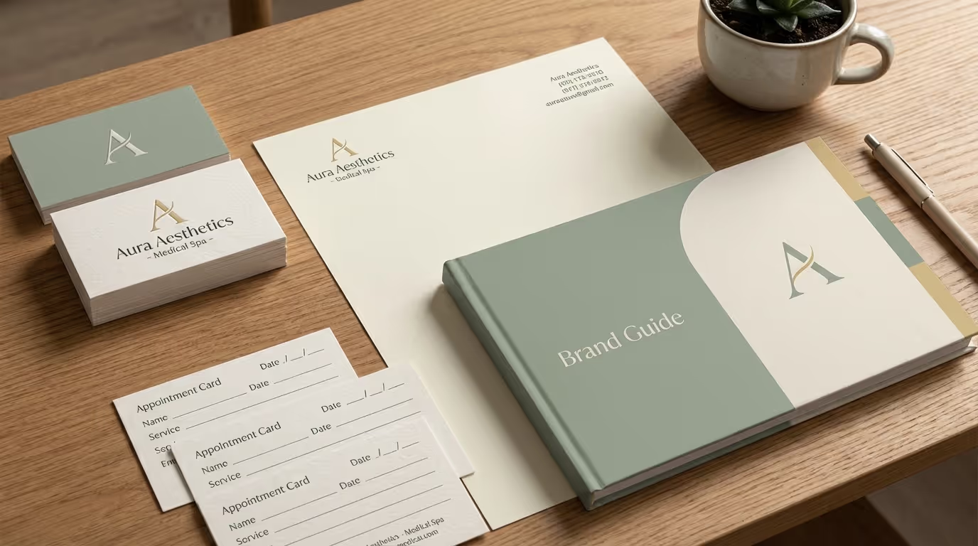
- Your in-clinic signage, treatment room screens, and printed materials
- Your patient intake forms and consent documents
- Your product packaging and retail displays
- Your landing pages and funnel assets
That is thousands of impressions per week. If your logo looks amateur, cheap, or generic, every single one of those impressions is silently undermining your credibility. Patients choosing between two med spas with similar reviews, similar treatments, and similar pricing will choose the one that looks more professional and trustworthy. Your logo is the visual shorthand for that trust.
The Revenue Impact of Logo Quality
This is not abstract. Here is what the data shows about visual brand quality in aesthetic practices:
| Metric | Weak Brand Identity | Strong Brand Identity | Difference |
|---|---|---|---|
| Website conversion rate | 1.5-2.5% | 4-7% | 2-3x higher |
| Price per unit (Botox) | $10-12 | $14-18 | 30-50% premium |
| Patient trust on first visit | 45% rate as "very trustworthy" | 78% rate as "very trustworthy" | +73% |
| Referral rate | 12-18% | 25-40% | 2x higher |
| Cost per acquisition | $300-500 | $150-250 | 40-50% lower |
These numbers come from comparing practices with professional brand identities to those with DIY or template-based branding — same market, same services, same provider quality. The logo and visual identity is the variable.
A practice generating $1.5 million annually that increases conversions from 2.5% to 5% and reduces acquisition costs by 40% is looking at $200,000-400,000 in additional annual revenue. A professional logo investment of $2,000-5,000 delivers a 40x-80x return. There is no other investment in your practice with that kind of multiplier.
First Impressions Are Permanent Impressions
Research from the Missouri University of Science and Technology found that it takes 0.05 seconds — 50 milliseconds — for users to form an opinion about a website. That opinion is driven almost entirely by visual design, and the logo is the anchor element.
Once that first impression forms, it creates a cognitive bias that colors every subsequent interaction. A patient who initially perceives your practice as "premium" will interpret your pricing, your reviews, and your results through that lens. A patient who initially perceives your practice as "budget" will look for evidence to confirm that bias — and they will find it.
Your logo does not just represent your brand. It creates the frame through which patients experience your entire practice.
The 5 Principles of Effective Med Spa Logo Design
Before we get into trends and inspiration, understand these foundational principles. Trends change. These principles do not.
Principle 1: Simplicity
The most effective logos in any industry are simple. Think Apple, Nike, Chanel. In the med spa space, simplicity communicates sophistication and confidence. A complex logo with multiple elements, gradients, and decorative flourishes screams "trying too hard."
What simple means for med spas:
- Clean typography as the primary element
- One icon or symbol maximum (if any)
- No more than 2 colors in the primary logo
- No gradients, shadows, or 3D effects in the core logo (these can appear in marketing materials, not the logo itself)
- The logo should work at business card size without losing legibility
Implementation steps for simplifying your logo concept:
- Write your practice name on a blank page. That is your starting point.
- Choose one font treatment that communicates your positioning (more on this below).
- If you add an icon, it must serve a purpose beyond decoration. Ask: "Would the logo be weaker without this element?" If the answer is no, remove it.
- Test legibility at 1 inch wide. If any element is unreadable, it is too complex.
- Show the logo to 5 people who are not designers. If they cannot recall it from memory after 5 seconds, simplify further.
Principle 2: Medical Credibility
Your logo must communicate that you are a medical practice, not a day spa. This does not mean slapping a caduceus or stethoscope on it. It means the overall design feels clinical, precise, and authoritative — while still being warm and inviting.
How to signal medical credibility:
- Clean, structured typography (not script or handwritten fonts)
- Precise geometry in any icons or symbols
- A color palette that balances warmth with professionalism (more on this below)
- Include "Medical Spa," "Medical Aesthetics," or "MD" in the full logo lockup
- Avoid overly decorative or feminine elements that signal "day spa" over "medical facility"
The credibility spectrum:
| Too Clinical | Just Right | Too Spa-Like |
|---|---|---|
| Hospital logo aesthetic | Clean, modern, warm professionalism | Day spa / wellness center |
| Cold, sterile, institutional | Confident, approachable, premium | Soft, feminine, non-medical |
| Blue + white, medical cross | Deep navy/black + warm accent | Pastels, watercolors, script fonts |
Your logo should live in the "Just Right" column — medical enough to command trust, warm enough to feel inviting.
Principle 3: Timelessness Over Trendiness
A logo should last 10-15 years minimum. If your logo looks dated in 3 years, you wasted the investment. Design for longevity, not for whatever is trending on Dribbble this month.
The most durable med spa logos use classic typography, restrained color palettes, and minimal decorative elements. They look contemporary without being trapped in a specific moment.
Timelessness test:
- Would this logo have looked good in 2020? If yes, it has historical durability.
- Will this logo still look good in 2030? If you cannot confidently say yes, it is too trend-dependent.
- Does the logo rely on a specific design trend (gradient mesh, 3D effects, neon colors) that will date it? Remove the trend-dependent element.
Examples of timeless design decisions:
- Serif or clean sans-serif typography (not display fonts or novelty typefaces)
- Black, navy, or deep neutral primary colors
- Geometric icons based on simple shapes
- No texture overlays, metallic effects, or dimensional treatments in the core logo
Principle 4: Versatility
Your logo needs to work everywhere:
- Full color on a white background (website, print)
- White on a dark background (signage, dark-mode social media, photography overlays)
- Single color (embroidery on uniforms, merchandise)
- Small scale (social media profile photo, favicon — 32x32 pixels)
- Large scale (building signage, trade show banners — 10+ feet wide)
If your logo only looks good in one context, it is not a logo — it is a graphic that happens to be on your website.
Versatility checklist:
| Application | Size | Requirements |
|---|---|---|
| Favicon | 32x32 px | Readable icon mark |
| Social media avatar | 110x110 px | Recognizable in a circle crop |
| Business card | 2 inches wide | Full logo readable |
| Email signature | 200px wide | Clean at screen resolution |
| Website header | 150-300px wide | Balanced with navigation |
| Vehicle wrap | 2-4 feet wide | High contrast at distance |
| Building sign | 4-10 feet wide | Legible from 50+ feet |
| Trade show banner | 6-8 feet wide | Impact at 20+ feet |
Implementation step: Before finalizing your logo, create mockups at every size listed above. If any application fails, the logo needs refinement.
Principle 5: Distinctiveness
There are over 10,000 med spas in the US. If your logo could belong to any of them, it belongs to none of them. Your logo needs at least one distinctive element — a unique typographic treatment, a custom icon, an unexpected color choice — that makes it recognizably yours.
Walk down any med spa corridor in Scottsdale, Beverly Hills, or Miami. You will see dozens of logos that are virtually interchangeable: thin serif font, rose gold accent, maybe a leaf or droplet icon. They all blend together. Do not add to the noise.
How to create distinctiveness without complexity:
- Custom typographic treatment — Modify one letter in your name (a unique cut, an extended stroke, a connected ligature). This is subtle but instantly ownable.
- Unexpected color choice — Instead of the standard navy or rose gold, choose a deep emerald, a rich burgundy, or an electric purple. Your color becomes your identifier.
- A proprietary icon — If you use an icon, it should be custom-designed, not pulled from a stock icon set. A custom icon is trademarkable and cannot be duplicated.
- Intentional spacing or arrangement — How elements are arranged (stacked, horizontal, overlapping) creates visual uniqueness even with standard elements.
Common distinctiveness mistakes:
- Adding more elements instead of making existing elements unique
- Using a trendy design effect as the distinctiveness factor (this expires with the trend)
- Being different for the sake of being different (a neon green med spa logo is distinctive but wrong)
Medspa Logo Ideas and Trends in 2026
These are the current trends we see in effective med spa branding. Use them as inspiration, not as a template. The best logo borrows from trends selectively while maintaining timelessness.
Trend 1: Bold, Modern Sans-Serif Typography
The days of delicate, ultra-thin serif fonts dominating the med spa space are fading. The 2026 shift is toward bold, modern sans-serif typefaces that communicate confidence and authority.
Think Montserrat Bold, Outfit, Clash Display, or custom geometric sans-serifs. These fonts look premium, are highly legible at all sizes, and feel contemporary without being trendy.
This trend reflects a broader shift in med spa branding: away from "gentle, spa-like, feminine" positioning and toward "bold, medical, results-driven" positioning. Your logo should match that energy.
Implementation:
- Start with a geometric sans-serif family (Outfit, Montserrat, General Sans, Satoshi)
- Test bold and semi-bold weights for the practice name
- Use a lighter weight from the same family for the descriptor ("Medical Spa," "Aesthetics")
- Adjust letter-spacing (tracking) to find the right balance between compact confidence and airy elegance
Trend 2: Wordmarks Over Symbols
The most effective med spa logos in 2026 are wordmarks (logotypes) — the practice name rendered in a distinctive typeface, sometimes with a subtle typographic modification.
Why wordmarks work for med spas:
- They communicate the name directly (no guessing what the symbol means)
- They are inherently simpler and more versatile
- A custom typographic treatment gives distinctiveness without adding complexity
- They work at every size without losing the name or meaning
This does not mean you cannot have an icon. But the icon should be secondary — a companion mark used for favicons, social media avatars, and branded elements. The primary logo should be the wordmark.
The modern logo system approach:
| Logo Element | Primary Use | When to Use |
|---|---|---|
| Full wordmark | Website header, print, signage | Default — use everywhere possible |
| Wordmark + descriptor | Formal communications, large applications | When space allows and context needs clarity |
| Icon mark only | Favicon, social avatar, watermark, app icon | Small applications where the wordmark would be unreadable |
| Stacked wordmark | Vertical applications, square formats | When horizontal space is limited |
Trend 3: Deep, Saturated Color Palettes
Rose gold is out. Soft pastels are fading. The trend is toward deeper, more saturated colors that communicate confidence and premium positioning.
Colors working well for med spas in 2026:
- Deep navy (#0A1628 range)
- Rich emerald green (#0D5C3F range)
- Electric or deep purple (#3A1D8E range)
- True black paired with one bold accent color
- Warm metallics (gold, not rose gold) used sparingly
The shift is from "soft and approachable" to "premium and authoritative." Your color palette should make a patient feel like they are entering a high-end medical facility, not a chain day spa.
Trend 4: Monochromatic and Two-Tone Designs
Logos that use a single color (or black/white with one accent color) feel more premium and versatile than multi-color logos. A monochromatic logo works in every context without adaptation.
The two-tone approach — typically a dark primary color with one warm accent — gives enough visual interest without complexity. Think black wordmark with a gold accent on a specific letter or element.
Two-tone implementation guide:
- Choose your primary wordmark color (black, navy, or charcoal)
- Choose one accent color that communicates your positioning (gold for luxury, teal for wellness, purple for innovation)
- Apply the accent color to a single element: one letter, the descriptor text, an underline, or the icon
- The ratio should be approximately 85-90% primary, 10-15% accent
Trend 5: Subtle Typographic Details
Rather than relying on icons for distinctiveness, the trend is toward custom typographic treatments:
- A modified letter (cutting, extending, or connecting a specific character)
- A custom ligature (two letters that flow together uniquely)
- An integrated symbol within the letterforms (a subtle line or shape embedded in the type)
- Strategic use of weight contrast (one word bold, the next light) within the practice name
These details are subtle but distinctive. They make the wordmark unique without adding visual complexity.
Examples of effective typographic modifications:
- Extending the crossbar of an "A" to create a line element
- Removing the counter from an "O" or "D" to create a clean geometric shape
- Connecting the final letter of the practice name to a subtle icon element
- Using a different weight or color for a single letter to create emphasis
Trend 6: Minimalist Icon Companions
When icons are used, they are minimal and abstract — not literal representations of syringes, faces, or medical crosses.
Effective med spa icon trends:
- Abstract geometric shapes (circles, arcs, intersecting lines)
- Stylized initials
- Subtle botanical elements (single leaf, stem — not full illustrations)
- Precision-focused symbols (clean lines, perfect geometry)
Avoid literal medical imagery. A syringe icon makes your logo look like a pharmacy. A face outline makes it look like a plastic surgery clinic. Abstract symbols let the patient's brain fill in the meaning — which is more powerful than spelling it out.
Typography Deep Dive for Med Spa Logos
Typography is the single most important element of your logo. Get the font right and everything else falls into place.
Sans-Serif vs. Serif vs. Script
Sans-Serif (recommended for most med spas):
- Modern, clean, confident
- Examples: Montserrat, Outfit, Poppins, Clash Display, General Sans, Satoshi, Plus Jakarta Sans
- Best for practices positioning themselves as modern, tech-forward, or results-driven
- Readability at small sizes: Excellent
- Timelessness score: High
Serif (strong alternative for luxury positioning):
- Classic, refined, authoritative
- Examples: Playfair Display, Cormorant, Lora, Freight Display, Ayer Poster
- Best for practices positioning themselves as luxury, established, or physician-led
- Readability at small sizes: Good (choose fonts with thicker strokes)
- Timelessness score: Very high
Script/Handwritten (use with extreme caution):
- Feminine, personal, boutique
- Very difficult to make look premium at small sizes
- Often looks dated or unprofessional in a medical context
- If you must use script, pair it with a strong sans-serif or serif for balance — and never use it as the primary typeface for your practice name
- Readability at small sizes: Poor
- Timelessness score: Low
Font Selection Framework
Follow this decision tree to choose the right typography for your practice:
Step 1: Define your positioning.
- Modern, results-driven → Sans-serif
- Classic luxury → Serif
- Boutique, personal → Serif or carefully chosen sans-serif
Step 2: Choose a font family. Test 3-5 options by typing your practice name in each font at multiple weights.
Step 3: Select the weight.
- Premium positioning → Semi-bold to Bold
- Luxury positioning → Regular to Medium
- Avoid Light and Thin weights for the primary wordmark (legibility issues at small sizes)
Step 4: Adjust tracking (letter-spacing).
- All-caps wordmarks → +10% to +20% tracking for a spacious, luxury feel
- Title-case wordmarks → Default to +5% tracking
- Short names (1-2 words) → Can use tighter tracking for density and impact
- Long names (3+ words) → Looser tracking to prevent cramping
Step 5: Test at every size. Print your logo at business card size. View it as a favicon on screen. Mock it up on a building sign. If it fails at any size, iterate.
Font Pairing in Logo Lockups
Most med spa logo lockups include two text elements: the practice name and a descriptor (like "Medical Spa" or "Aesthetic Medicine"). These should use contrasting but complementary typefaces.
Effective pairings:
- Bold sans-serif name + light sans-serif descriptor (same family, different weights)
- Bold sans-serif name + elegant serif descriptor (contrast creates visual interest)
- All-caps name + title-case or small-caps descriptor (case contrast)
Avoid:
- Two decorative fonts (visual chaos)
- Script name + script descriptor (illegible)
- Fonts that are too similar (no contrast = visual monotony)
Specific font pairing recommendations for med spas:
| Practice Name Font | Descriptor Font | Positioning |
|---|---|---|
| Outfit Bold | Outfit Light | Modern, clean, unified |
| Clash Display Bold | Inter Regular | Bold, contemporary, authoritative |
| Playfair Display | Source Sans Light | Luxury, classic, refined |
| Montserrat Bold | Cormorant Regular | Modern name + classic descriptor contrast |
| General Sans Bold | General Sans Light | Minimal, clean, versatile |
Tracking and Weight
The spacing between letters (tracking) dramatically affects how your logo feels:
- Tight tracking: Dense, bold, modern, editorial (works well for short names)
- Wide tracking: Airy, luxury, elegant, spacious (works well for all-caps designs)
Font weight matters too:
- Bold/Black: Confident, commanding, modern
- Medium/Regular: Balanced, approachable, versatile
- Light/Thin: Elegant, refined, luxury — but can feel weak at small sizes
Choose tracking and weight based on your brand positioning, not personal preference. A results-driven practice in a competitive market should lean toward tighter tracking and bolder weight. A luxury boutique practice can go lighter and more spacious.
Color Psychology for Med Spa Logos
Color choices are not arbitrary. Each color triggers specific psychological associations that either help or hurt your brand perception.
Best Colors for Med Spa Logos
| Color | Hex Range | Associations | Best For | Industry Examples |
|---|---|---|---|---|
| Deep Navy / Dark Blue | #0A1628 - #1A365D | Trust, authority, professionalism, medical credibility | Physician-led practices, multi-location brands | SkinSpirit, Westlake Dermatology |
| Black | #000000 - #1A1A1A | Luxury, sophistication, modernity, power | Premium practices, minimalist branding, urban markets | Black market positioning |
| Deep Purple | #2D1B69 - #4A2C8A | Innovation, premium quality, creativity, transformation | Practices emphasizing cutting-edge treatments and technology | Disruptive, tech-forward brands |
| Emerald Green | #0D5C3F - #1A7A4F | Health, renewal, balance, growth | Wellness-focused practices, holistic or integrative med spas | Wellness-first positioning |
| Gold (true gold, not rose) | #B8860B - #DAA520 | Luxury, exclusivity, premium quality | High-end practices, VIP positioning, accent color | Ultra-luxury practices |
| White | #FFFFFF | Cleanliness, simplicity, purity | Universal — almost every med spa logo needs to work in white on dark backgrounds | N/A (background/inverse) |
Colors to Avoid or Use Carefully
| Color | Risk | When It Might Work | Better Alternative |
|---|---|---|---|
| Pink / Rose Gold | Overused, looks generic, limits audience | Only if exclusively targeting a female demographic at a truly premium level | Burgundy or plum for similar warmth without the "generic med spa" feel |
| Bright Red | Aggressive, medical emergency associations | Almost never for med spas | Deep burgundy or wine for warmth without alarm |
| Neon / Electric Colors | Cheap, gimmicky, not medical | Only as a micro-accent if intentionally disruptive | Deep saturated version of the same hue |
| Multiple bright colors | Childish, unfocused, not premium | Almost never | Two-color maximum in the logo |
| Light pastels | Weak, forgettable, blend into backgrounds | Secondary palette elements, never primary logo | Deep, saturated version of the pastel |
The Two-Color Rule
Your logo should use a maximum of two colors (plus black and white). More than that creates visual complexity that undermines the perception of quality.
Choose:
- Primary color: The dominant color of your wordmark. This is your brand color. It should work on both light and dark backgrounds.
- Accent color: Used sparingly for emphasis — an underline, a dot, a single letter, or the descriptor text. This color creates visual interest and directs the eye.
Your full brand palette can include 5-8 colors for marketing materials, website, and social media. But the logo itself stays restrained.
Color selection implementation steps:
- Define your brand positioning (luxury, modern, clinical, wellness)
- Choose a primary color that aligns with that positioning using the table above
- Choose an accent color that creates contrast and warmth
- Test the combination on white, black, dark blue, and photographic backgrounds
- Check accessibility — the colors must have sufficient contrast for readability (WCAG AA minimum)
- Create a color specification sheet with hex, RGB, CMYK, and Pantone values
The Step-by-Step Med Spa Logo Design Process
Whether you work with a designer or DIY, follow this process to ensure your logo serves your practice.
Phase 1: Discovery and Strategy (Week 1)
Before anyone opens a design tool, do the strategic work.
Step 1: Define your brand positioning. Complete this sentence: "[Practice Name] is the [type of practice] for [ideal patient] who wants [primary outcome]."
This sentence drives every design decision. A practice positioned as "the premier luxury aesthetics destination for affluent women who want age-defying results" needs a very different logo than "the accessible, modern med spa for young professionals who want preventive treatments."
Step 2: Audit your competitive landscape. Collect logos from 10-15 competitors in your market. Note:
- What colors dominate?
- What font styles are most common?
- What icons or symbols appear frequently?
- Where does the visual landscape feel crowded?
- Where is there a gap you can own?
Your logo should stand out against this competitive backdrop, not blend into it.
Step 3: Define your visual direction. Based on positioning and competitive analysis, write a brief statement: "Our logo should communicate [2-3 adjectives] through [type of typography] and [color direction]."
Example: "Our logo should communicate modern authority and approachable expertise through a bold geometric sans-serif with a deep navy and warm gold color palette."
Phase 2: Concept Development (Weeks 2-3)
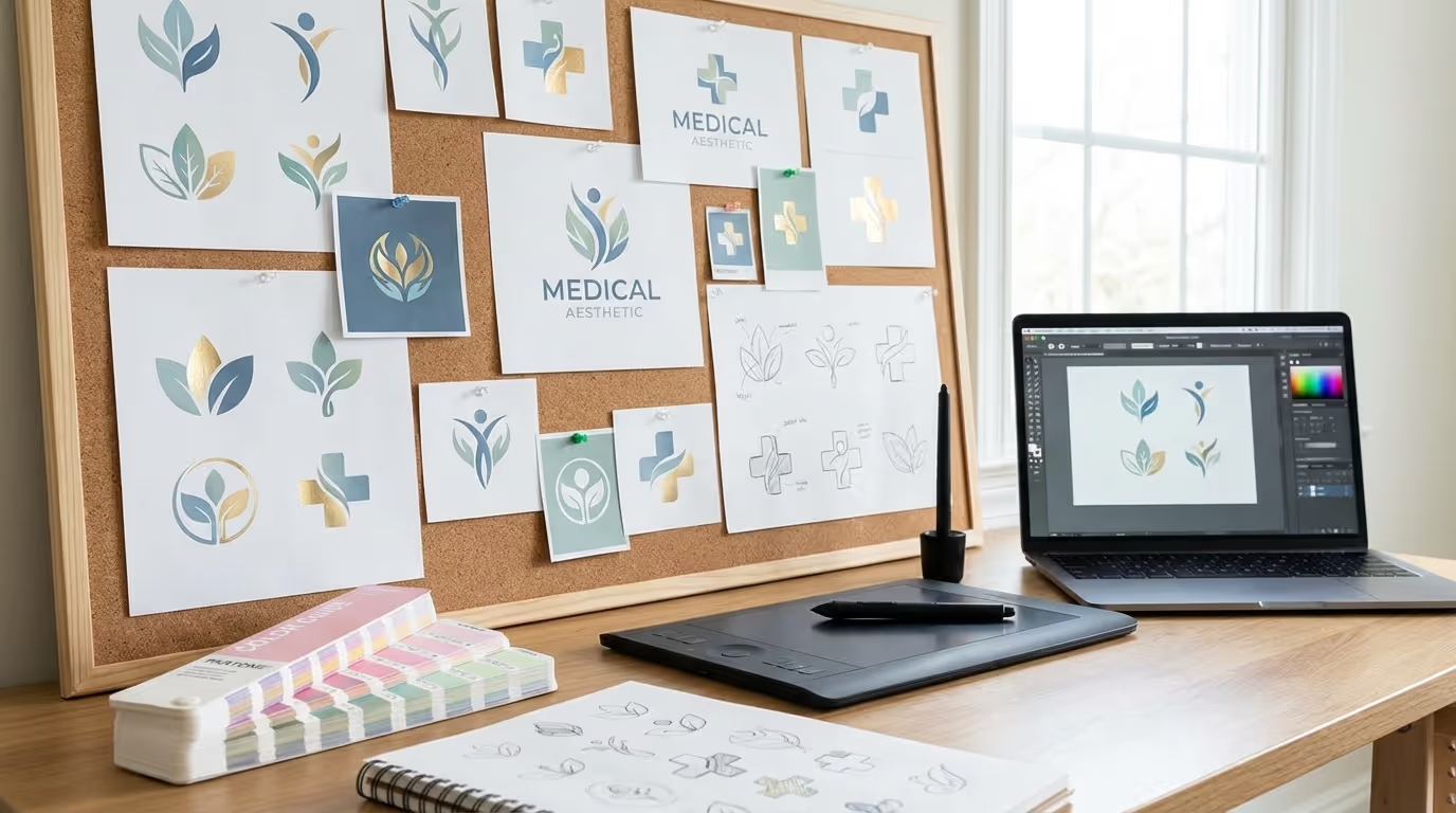
Step 4: Typography exploration. Test 5-7 typefaces using your practice name. Print them at multiple sizes. Narrow to 2-3 finalists based on:
- Alignment with brand positioning
- Legibility at all sizes
- Distinctiveness in your competitive landscape
- Available weights for the logo system
Step 5: Color development. Create 3-4 color palette options, each with a primary and accent color. Test each palette against:
- White background (website, print)
- Dark background (signage, dark mode)
- Photographic background (social media overlay)
Step 6: Concept creation. Develop 2-3 distinct logo concepts that combine typography, color, and (optionally) an icon element. Each concept should represent a different strategic direction:
- Concept A: Bold and modern
- Concept B: Classic and refined
- Concept C: Distinctive and unexpected
Phase 3: Refinement (Week 4)
Step 7: Select and refine. Choose one concept direction and refine it. This phase involves:
- Fine-tuning letter-spacing, kerning, and proportions
- Perfecting the color values
- Developing the full logo system (primary, stacked, icon, variations)
- Testing at every application size
Step 8: Create the logo system. Your final deliverables should include:
- Primary horizontal logo
- Stacked/vertical logo
- Icon mark (for small applications)
- All versions in: full color, single color, white, black
- File formats: SVG (vector), PNG (transparent), JPEG, PDF, EPS/AI
Step 9: Document usage guidelines. Create a one-page logo usage guide that covers:
- Minimum size
- Clear space requirements (minimum space around the logo)
- What not to do (stretch, rotate, change colors, add effects)
- Approved background colors
Phase 4: Application and Launch (Week 5)
Step 10: Apply across all touchpoints. Update your logo on:
- Website (header, footer, favicon)
- Google Business Profile
- Social media profiles (all platforms)
- Email signature and templates
- Print materials (business cards, letterhead, patient forms)
- Signage (interior and exterior)
- Merchandise and uniforms
Common Medical Spa Logo Design Mistakes
Mistake 1: The Canva Logo
We see this constantly. A practice opens, the owner goes to Canva, picks a template, changes the name, and calls it done. The result is a logo that looks exactly like 500 other businesses because it literally is the same template.
A $50 Canva logo communicates a $50 level of care. If you invested $500,000+ in your facility, equipment, and training, do not represent that investment with a template.
The hidden cost: A Canva logo is not trademarkable (you do not own the design elements), cannot be customized beyond template constraints, and will need to be completely replaced when you eventually rebrand — meaning you lose all brand equity built around that visual identity.
Mistake 2: Too Many Elements
Practice name + icon + tagline + descriptor + decorative elements + gradient. This is not a logo — it is a flyer. Strip it down. The strongest logos have 1-2 elements, not 5.
Test: Cover each element with your hand, one at a time. If the logo still works without that element, remove it.
Mistake 3: Following Expired Trends
Trends that were everywhere in 2018-2022 but now look dated:
- Rose gold everything
- Thin serif fonts (barely legible)
- Watercolor textures
- Leaf/botanical illustrations as primary elements
- Script fonts for the practice name
- Circle frames around the entire logo
- Excessive use of gold foil effects
- Gradient mesh backgrounds
- Line art face illustrations
If your logo has any of these elements, it is probably time for an update.
Mistake 4: A Logo That Only Works in One Context
Your designer shows you the logo on a beautiful mockup — white background, plenty of space, perfect size. It looks stunning. Then you try to use it as your Instagram profile picture and it is an illegible blur. You put it on a dark background and it disappears. You embroider it on a uniform and the fine details vanish.
Demand a full logo system from your designer:
- Primary logo (horizontal lockup)
- Stacked logo (vertical lockup)
- Icon/mark only (for small applications)
- All versions in full color, white, and black
- Minimum size specifications
- Clear space requirements
Mistake 5: Making Decisions by Committee
"Let me ask my team what they think" — and suddenly 8 people with different tastes, zero design training, and conflicting opinions are directing a logo design. This process produces logos that offend nobody and inspire nobody.
Your logo does not need to be everyone's favorite. It needs to communicate the right message to your target patient. Trust your designer's expertise. Get input from 1-2 stakeholders maximum. Make a decision and commit.
Decision-making framework for logo approval:
- Does it align with our brand positioning? (Non-negotiable)
- Is it versatile across all applications? (Non-negotiable)
- Is it distinctive in our competitive landscape? (Non-negotiable)
- Do I personally love it? (Nice to have, not a requirement)
Mistake 6: Choosing Based on Personal Preference Instead of Strategy
"I love purple" is not a brand strategy. Your logo colors, typography, and style should be driven by your target patient demographic, competitive landscape, and brand positioning — not your personal aesthetic preferences.
A med spa targeting affluent women 40-60 in Scottsdale needs a different visual identity than a practice targeting young professionals 25-40 in Austin. Your logo should reflect your patient, not your Pinterest board.
Mistake 7: Underinvesting in the Design
A logo is not a commodity. It is the visual foundation of a brand that you will build for years. The difference between a $300 logo and a $3,000 logo is not just quality — it is strategic thinking, competitive analysis, typography expertise, and a system that works at every scale.
Cost-per-impression math: If your logo generates 5,000 impressions per week across all touchpoints, a $3,000 logo costs $0.01 per impression in the first year and gets cheaper every year after. There is no marketing investment with a lower cost per impression.
Mistake 8: Not Protecting Your Logo Legally
Many med spa owners do not trademark their logo. This means a competitor can create a similar design and you have limited legal recourse. File a trademark through the USPTO once your logo is finalized.
Trademark steps:
- Search the USPTO database to confirm your design is unique
- File an application in the appropriate class (Class 44 for healthcare services)
- Budget $350-500 for the filing fee plus attorney costs
- Allow 6-12 months for processing
How to Work with a Logo Designer
What to Look for in a Designer
- Portfolio with medical or wellness brands. A designer who specializes in tech startups will approach your logo differently than one who understands healthcare and aesthetics.
- Brand strategy capability. The best designers do not just make things look pretty. They ask about your target audience, competitive landscape, and brand positioning before sketching a single concept.
- A defined process. Discovery → concepts → refinement → final delivery. If a designer is willing to start drawing logos without understanding your business, find someone else.
- Deliverables beyond just a logo file. You need a full logo system with multiple lockups, color variations, file formats (vector AI/EPS, PNG, SVG, JPEG), and basic usage guidelines.
What to Expect to Pay
| Level | Price Range | What You Get | Recommended For |
|---|---|---|---|
| Template/DIY | $0 – $100 | Canva or template. Looks like everyone else. | Never recommended |
| Freelance designer (junior) | $300 – $800 | Basic logo with 2-3 concepts and revisions. | Very early startups on extremely tight budgets |
| Freelance designer (experienced) | $1,000 – $3,000 | Strategic logo design with brand research, multiple concepts, full logo system. | Most med spas — sweet spot for value |
| Branding agency | $5,000 – $20,000+ | Complete brand identity — logo, color palette, typography system, brand guidelines, stationery, social media templates. | Established practices investing in a full rebrand |
For a new med spa, $1,500-$3,000 with an experienced freelance designer is the sweet spot. You get strategic thinking, professional execution, and a complete logo system without the overhead of an agency.
How to Brief Your Designer
A strong creative brief saves time, money, and revisions. Include:
- About your practice: Name, location, treatments offered, years in business, what makes you different. Reference your business plan for key positioning details.
- Target patient: Demographics, psychographics, what they value, what they fear. Be as specific as possible — "affluent women 35-55 in metro Phoenix who have been to other med spas and want a more premium experience."
- Brand positioning: Premium vs. accessible, clinical vs. lifestyle, modern vs. established, bold vs. refined.
- Competitive context: 5-10 competitor logos with notes on what you like and dislike about each.
- Visual preferences: 10-15 examples of logos from any industry that you feel align with your desired brand perception. Note what specifically you like about each.
- Non-negotiables: "Must include MD," "Cannot use pink," "Must work well on a dark background."
- What to avoid: Specific styles, colors, or elements you do not want.
The Review Process
- Round 1: The designer presents 2-3 distinct concepts. Evaluate them against your brief and brand strategy, not personal taste. Choose one direction.
- Round 2: Refinement of the chosen concept. Typography adjustments, color fine-tuning, spacing, proportions.
- Round 3: Final polish and production of all logo variations and file formats.
Feedback framework for each round:
| Good Feedback | Bad Feedback |
|---|---|
| "The typeface feels too casual for our medical positioning — can we explore something with more structure?" | "I don't like it" |
| "The icon competes with the wordmark — can we simplify or reduce its scale?" | "Make it pop more" |
| "This feels too similar to [competitor name] — how can we differentiate?" | "My spouse thinks it should be pink" |
| "At favicon size, the detail in the icon is lost — can we create a simplified version?" | "Can you just try a bunch of different options?" |
When to Rebrand Your Logo
Not every outdated logo needs a complete replacement. Sometimes a refresh is enough.
Signs You Need a Full Rebrand
- Your logo was designed on Canva or by a non-professional
- Your practice has fundamentally changed (new ownership, new services, new market positioning)
- Your logo looks identical to several competitors
- Patients or staff frequently comment that your branding does not match the quality of your practice
- Your logo does not work on digital platforms (too complex, wrong proportions, unreadable at small sizes)
- You are opening new locations and the current brand will not scale
Signs You Need a Logo Refresh (Not Full Rebrand)
- The overall design is solid but uses dated elements (a trendy font from 2018, rose gold that now looks generic)
- You need additional logo variations (icon version, stacked version) that your current designer never created
- Minor typography or color updates would bring the logo into current standards
- Your digital applications need optimization (better favicon, social media avatar)
Rebrand vs. Refresh: Cost and Timeline Comparison
| Factor | Logo Refresh | Full Rebrand |
|---|---|---|
| Timeline | 1-2 weeks | 4-8 weeks |
| Cost | $500 - $2,000 | $2,000 - $15,000 |
| Brand equity risk | Low — patients still recognize you | Higher — need a transition strategy |
| When to choose | Logo foundation is solid, just needs updating | Logo foundation is fundamentally flawed |
| Deliverables | Updated files, possibly new variations | Complete new logo system + brand guidelines |
The Rebrand Transition Plan
If you do a full rebrand, do not just swap the logo overnight. Plan the transition:
- Week 1: Update digital assets (website, social profiles, email signatures, Google Business Profile)
- Week 2: Update print materials and in-office signage
- Week 3: Announce the rebrand to patients via email and social media — tell the story behind the change
- Month 2: Update remaining materials (uniforms, vehicle wraps, third-party listings)
- Month 3: Audit all touchpoints to ensure nothing was missed
Your Logo Is Just the Beginning
A great med spa logo design is essential, but it is one piece of your brand identity and med spa branding. Your website, social media, printed materials, in-clinic experience, and marketing all need to align with and reinforce what your logo communicates.
If your logo says "premium" but your website says "2019", you have a brand consistency problem. If your logo says "modern and bold" but your social media content is generic and uninspired, your brand promise is not landing.
Your logo sets the expectation. Everything else needs to deliver on it.
The Brand Consistency Audit
After finalizing your logo, audit every patient touchpoint:
| Touchpoint | Does It Match the Logo's Quality? | Priority to Fix |
|---|---|---|
| Website | High | |
| Google Business Profile | High | |
| Social media profiles | High | |
| Email templates | Medium | |
| In-office signage | Medium | |
| Patient forms | Medium | |
| Print materials | Low | |
| Uniforms | Low |
Any touchpoint that does not match the quality level communicated by your logo creates a brand gap. Those gaps erode the trust your logo is building.
Get Your Free Marketing Audit
If your med spa branding is not matching the quality of your treatments — or if you need fresh medspa logo ideas — we will audit your entire marketing presence for free.
We work exclusively with med spas, and we know exactly what builds trust and what breaks it. Every audit includes logo and brand assessment, website review, competitive analysis, and a prioritized action plan.
No generic recommendations. No fluff. Just a clear assessment from a team that lives and breathes med spa marketing.