
Your website is a brochure. Your landing page is a salesperson. And right now, most med spa landing pages are terrible salespeople.
The average med spa website converts at 2-3%. That means 97 out of every 100 visitors leave without taking action. You paid to get them there — through Google Ads, Meta Ads, SEO, social media — and 97% of them bounce.
A properly built landing page converts at 10-20%. Some of the highest-performing med spa landing pages we have built convert at 25%+. The difference between 3% and 15% conversion on 1,000 monthly visitors is the difference between 30 leads and 150 leads. Same traffic. Same ad spend. Five times the result.
Landing pages are not about pretty design. They are about persuasion architecture — a deliberate sequence of elements that moves a visitor from "I'm interested" to "I'm booking." And that architecture follows specific, testable, repeatable principles.
This guide breaks down exactly how to build med spa landing pages that convert — the structure, the copy, the design, the trust elements, implementation steps for each section, benchmarks to measure against, and the mistakes that are costing you patients right now.
Why Landing Pages, Not Your Website
Your website serves multiple purposes: brand building, SEO, information, patient portal, careers page. A landing page serves one purpose: conversion.
| Element | Website Homepage | Dedicated Landing Page |
|---|---|---|
| Navigation menu | Full menu (15+ links) | None — removed entirely |
| Purpose | Multiple (inform, explore, navigate) | Single (convert) |
| Audience | All visitors (organic, direct, referred) | Specific (paid traffic with known intent) |
| Message | General practice overview | Specific treatment/offer match |
| CTAs | Multiple (book, call, learn, read) | Single (one action repeated) |
| Average conversion rate | 2-5% | 10-25% |
| Distractions | High (links, menus, sidebars) | Zero (every element drives conversion) |
The data is unambiguous:
| Finding | Source | Impact |
|---|---|---|
| Landing pages convert 2-5x higher than website pages for paid traffic | Industry benchmarks | 2-5x more leads from same spend |
| Removing navigation increases conversion by 28-40% | Unbounce research (100K+ pages) | Fewer exits, more conversions |
| Message match (ad → landing page) increases conversion 50%+ | WordStream analysis | Better Quality Score + higher conversion |
| Each additional form field reduces conversion by 5-10% | HubSpot research | Fewer fields = more leads |
Every dollar you spend on paid advertising without dedicated landing pages is underperforming by at least half. If you are spending $5,000/month on Google Ads sending traffic to your homepage, you are wasting $2,500+ in potential conversions.
The Anatomy of a High-Converting Med Spa Landing Page
Every high-performing med spa landing page follows the same 9-section structural framework. The specifics vary by treatment and offer, but the architecture is consistent.
Section 1: Hero Section (Above the Fold)
The hero section has one job: stop the scroll and make the visitor want to keep reading. You have 3-5 seconds.
Required elements with implementation steps:
Headline
The headline must be specific, outcome-focused, and match the ad that brought them here.
| Headline Type | Good Example | Bad Example | Why |
|---|---|---|---|
| Outcome-focused | "Get Smoother, Younger-Looking Skin in One 30-Minute Treatment" | "Welcome to Our Med Spa" | Outcome vs. generic greeting |
| Offer-specific | "Botox Starting at $10/Unit — Board-Certified Injectors, Same-Day Appointments" | "Your Journey to Beauty Starts Here" | Specificity vs. vague promise |
| Problem-solution | "Lose 20+ Pounds Without Surgery — Medical Weight Loss That Works" | "The Art and Science of Aesthetics" | Clear benefit vs. meaningless tagline |
| Social proof | "Rated 4.9 Stars by 500+ Patients — [City]'s Most Trusted Med Spa" | "Discover Your Best Self" | Credibility vs. cliche |
Implementation step: Write 5 headline variations before launching. Test 2 at a time via A/B testing. The winning headline can increase conversion by 20-50%.
Sub-headline
One to two sentences expanding on the headline with a specific benefit or differentiator. "Our RF microneedling treatments stimulate your skin's natural collagen production for results that last 12+ months."
Hero Image or Video
| Visual Type | Conversion Impact | Best For |
|---|---|---|
| Before/after photos | Highest | Injectable, skin treatment, body contouring pages |
| Treatment in progress video | Very high (+20-30% engagement) | Injectables, facials, laser pages |
| Results/outcome photo | High | All treatment types |
| Provider photo | Medium-high | Consultation-focused pages |
| Facility exterior | Low | Avoid — does not drive conversion |
| Stock photography | Lowest | Avoid entirely |
Primary CTA Button
| CTA Text | Performance | When to Use |
|---|---|---|
| "Book Your Free Consultation" | Highest for high-ticket | Body contouring, weight loss, combination plans |
| "Claim Your $50 Off" | High for offer-driven | Injectables, promotional campaigns |
| "Get Your Price Quote" | High for price-sensitive | All treatments (lead magnet approach) |
| "See Available Appointments" | Medium-high | When scheduling is the conversion goal |
| "Learn More" | Low | Avoid — too passive |
| "Submit" | Lowest | Never use — zero urgency |
CTA button design rules:
- High-contrast color that appears ONLY on CTA elements (not elsewhere on the page)
- Large enough to tap easily on mobile (minimum 44x44 pixels)
- Action-oriented text (verb + benefit)
- Visible without scrolling on both desktop and mobile
Trust Indicators (Immediately Visible)
Place these in or directly below the hero:
| Trust Element | Example | Purpose |
|---|---|---|
| Star rating + review count | "4.9 ★ from 347 Google Reviews" | Instant credibility |
| Years/treatments stat | "Over 12,000 treatments performed" | Experience proof |
| Provider credential | "Board-certified providers" | Clinical trust |
| Featured in logos | Local media, awards | Third-party validation |
Section 2: Problem Agitation
After the hero, acknowledge the visitor's pain point. They clicked your ad because they have a problem. Show them you understand it.
Framework by treatment type:
| Treatment | Problem Statement | Agitation |
|---|---|---|
| Botox | "The lines keep getting deeper" | "Creams and serums cannot treat muscle-caused wrinkles. That requires a targeted solution." |
| Weight loss | "Diets and willpower are not working" | "Your body is fighting against you. The problem is not motivation — it is biology." |
| Body contouring | "Stubborn fat that ignores diet and exercise" | "Targeted fat loss through exercise is a myth. Your body decides where fat comes off." |
| Laser hair removal | "Tired of shaving, waxing, and ingrown hairs" | "You spend 72+ days of your life on hair removal that never lasts." |
| Skin treatments | "Your skin does not look how it used to" | "Sun damage, aging, and time take a toll that skincare alone cannot reverse." |
This section is short — 3-5 sentences. Its purpose is to create an emotional connection and transition the visitor to the solution.
Section 3: Solution Presentation
Present your treatment as the answer to their problem. Be specific. Be clinical. Be confident.
Include in this order:
- What the treatment is and how it works (patient-friendly language, not jargon)
- 3-5 key benefits (outcome-focused bullets, not feature descriptions)
- Treatment time and what to expect
- When results appear
- How long results last
Format this visually. Use icons, short paragraphs, and white space. Nobody reads dense paragraphs on a landing page.
| Formatting Element | Impact on Conversion | Implementation |
|---|---|---|
| Bullet points | +15% readability | Replace paragraphs with scannable bullets |
| Icons next to benefits | +10% engagement | Use simple, consistent icon set |
| Bold key phrases | +8% attention | Bold the outcome, not the feature |
| White space | +15% readability | Minimum 20px padding between sections |
| Numbers and data | +20% credibility | "Results in 7 days" > "Quick results" |
Section 4: Social Proof
This is where conversion either accelerates or stalls. Social proof is the most powerful persuasion element on your landing page.
Types of social proof to include (use at least 3):
| Social Proof Type | Conversion Impact | Implementation Steps |
|---|---|---|
| Video testimonials | Highest (2-3x vs. text) | Record 30-60 sec patient videos at follow-up appointments |
| Written testimonials | High | Collect via email, include first name + age + treatment |
| Before/after photos | Very high | Consistent lighting, clear labeling, required disclaimer |
| Review aggregation | High | "4.9/5 from 347 Google Reviews" with platform logos |
| Statistics | Medium-high | "Over 12,000 treatments" or "98% satisfaction rate" |
| Media mentions/awards | Medium | Local press features, industry recognition |
Before/after photo rules:
- Use consistent lighting, angle, and background
- Include "Individual results may vary" disclaimer (FTC/medical compliance)
- Show 4-6 pairs relevant to the specific treatment
- Label with treatment type and timeframe ("4 weeks post-treatment")
- Get written consent from every patient shown
For photography best practices, see our dedicated guide.
Section 5: Provider Credentials
Med spa patients are entrusting their appearance to your team. They need to know who is performing their treatment.
Include:
| Element | Example | Purpose |
|---|---|---|
| Provider name + credentials | "Sarah Kim, NP-C, CANS" | Professional qualification |
| Professional headshot | Friendly, approachable, clinical setting | Personal connection |
| Relevant certifications | "Advanced Botox Training, Allergan Diamond Provider" | Specialized expertise |
| Experience stats | "8 years of aesthetic medicine, 15,000+ injection procedures" | Volume proof |
| Personal philosophy | "My approach is always natural — you should look refreshed, not different" | Anxiety reduction |
Keep this section focused on the providers who perform the specific treatment the landing page promotes.
Section 6: The Offer
Make the offer explicit. What exactly is the visitor getting, and what do they need to do?
Effective med spa landing page offers ranked by conversion rate:
| Offer Type | Avg. Conversion Boost | Best For | Risk |
|---|---|---|---|
| Free consultation | +30-50% | High-ticket treatments | Low (time cost only) |
| Introductory pricing | +25-40% | Injectables, entry treatments | Moderate (margin impact) |
| Package deal | +20-35% | Series treatments | Low (commits patient) |
| Value-add bonus | +15-25% | All treatments | Low (added cost minimal) |
| Limited availability | +10-20% (urgency factor) | All treatments | None if genuine |
| Guarantee | +10-15% | Consultations | Low (rarely claimed) |
Offer presentation framework:
- State the offer clearly and specifically
- State the value ("$150 consultation, yours free")
- Add urgency if genuine ("Only 12 consultation spots this month")
- Remove risk ("No obligation — if we're not the right fit, we'll tell you")
For pricing strategy and promotion ideas, see our dedicated guides.
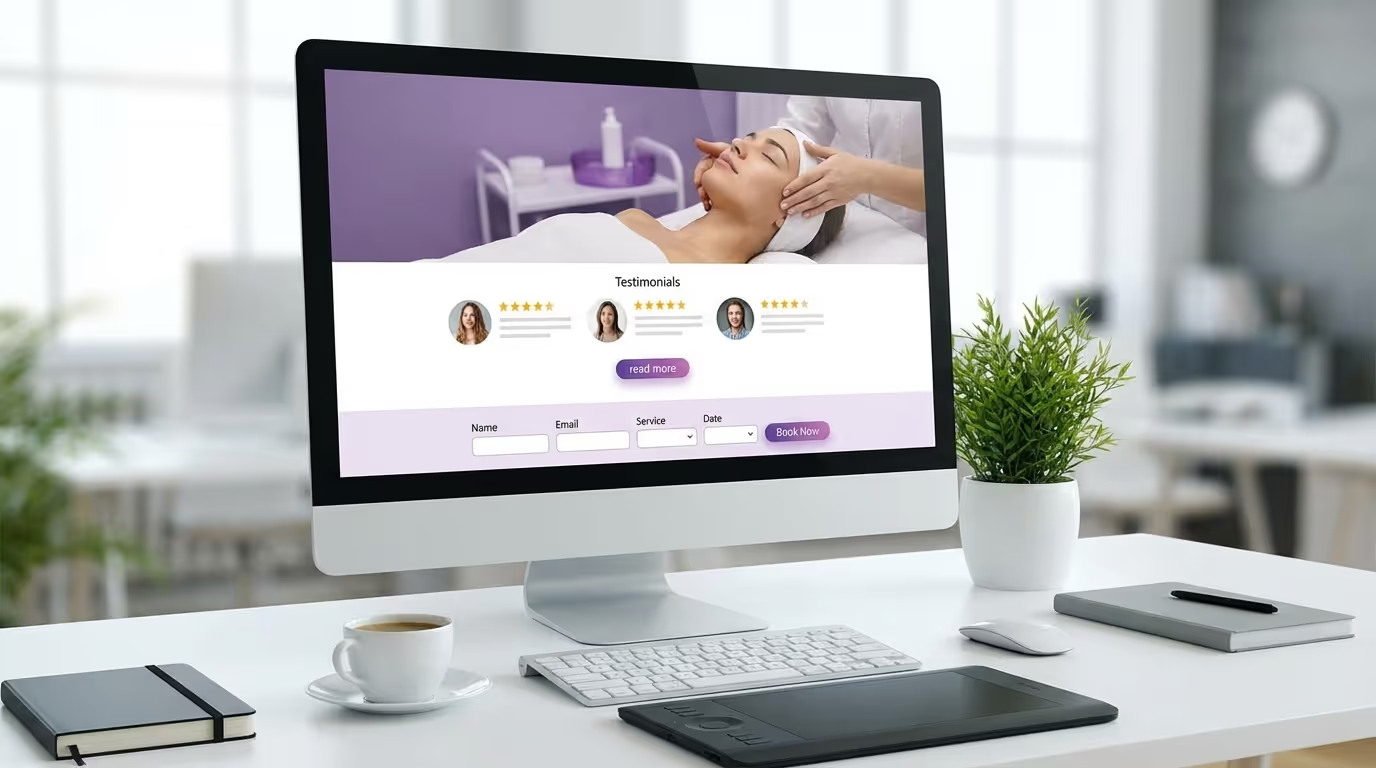
Section 7: The Form or Booking Widget
Everything above exists to get the visitor to this point.
Form optimization rules:
| Rule | Benchmark | Implementation |
|---|---|---|
| Minimum fields | 3-4 fields optimal | First name, phone, treatment interest, preferred time (optional) |
| Each additional field | -5-10% conversion | Remove any field you can collect later |
| Form placement | Above the fold + bottom of page | Two forms — primary and secondary |
| Mobile form fields | Large enough to tap without zoom | Minimum 44px height, 16px font |
| Submit button text | Action-oriented | "Book My Free Consultation" > "Submit" |
Email is optional on the primary form. You can collect it during the follow-up call. Phone number is the essential field — it enables immediate follow-up via call and SMS.
Booking widget vs. form:
| Approach | Conversion Impact | Best For |
|---|---|---|
| Lead capture form (request callback) | Baseline | Practices that prefer phone-first consultation |
| Direct booking widget (Jane, Boulevard) | +40-60% vs. form | Practices with self-serve scheduling |
| Both (form + "Or book directly") | Highest | Captures both preference types |
Confirmation page requirements:
After form submission, redirect to a page that:
- Confirms submission with specific next-step language
- Sets expectations: "We'll call you within 2 hours"
- Displays phone number for immediate contact
- Optionally presents an additional offer (refer a friend, download a guide)
This confirmation page is a prime opportunity for cross-selling or referral program enrollment.
Section 8: FAQ Section
Address the 5-7 most common objections. These are specific to the treatment and directly reduce anxiety that prevents conversion.
FAQ framework by treatment:
| Treatment | Top Questions to Answer |
|---|---|
| Botox | Does it hurt? How long does it last? What are side effects? How much does it cost? When will I see results? Will I look frozen? |
| Filler | Is it reversible? How long do results last? What areas can be treated? Does it look natural? What if I don't like the results? |
| CoolSculpting | How many sessions do I need? When do I see results? Does it hurt? Am I a good candidate? Is it permanent? |
| Weight loss | How much weight can I lose? Are there side effects? Is it medically supervised? What's included in the program? |
| Laser hair | How many sessions? Does it work on all skin types? Is it permanent? How do I prepare? |
Each answer should be 2-3 sentences — concise, confident, and ending with a subtle push toward booking: "The best way to find out if you're a good candidate is a quick 15-minute consultation with our team — there's no obligation."
Section 9: Final CTA
End the page with one more strong call to action. Repeat the offer, reinforce the key benefit, and make the action easy.
Template: "Ready to see what [treatment] can do for you? Book your free consultation today — it takes 15 minutes and there's zero obligation. [CTA Button: Book My Free Consultation]"
Landing Page Copy Frameworks
The PAS Framework (Problem-Agitation-Solution)
The most effective copywriting framework for med spa landing pages.
| Step | Purpose | Example (CoolSculpting) |
|---|---|---|
| Problem | Name the pain | "Stubborn fat that won't respond to diet or exercise" |
| Agitation | Amplify the emotional weight | "You've done everything right — but targeted fat loss through exercise is a myth" |
| Solution | Present your treatment | "CoolSculpting freezes and eliminates fat cells permanently — no surgery, no downtime" |
The AIDA Framework (Attention-Interest-Desire-Action)
| Step | Landing Page Element | Function |
|---|---|---|
| Attention | Hero headline | Stop the scroll |
| Interest | Problem agitation + solution | Build engagement |
| Desire | Social proof + provider credentials | Create wanting |
| Action | Offer + form + CTA | Drive conversion |
The "Before-After-Bridge" Framework
| Step | What It Does | Example |
|---|---|---|
| Before | Describe current frustration | "You avoid photos, hide behind filters, and feel self-conscious" |
| After | Paint the desired outcome | "Imagine looking in the mirror and loving what you see — smooth, even, glowing skin" |
| Bridge | Your treatment connects the two | "Our Morpheus8 treatment bridges that gap in just 3 sessions" |
Medical Spa Landing Page Design Principles
Visual Hierarchy
The eye should flow naturally: headline → hero image → CTA → social proof → form.
Implementation steps:
- CTA buttons should be the most visually prominent element (high-contrast color used nowhere else)
- Use adequate white space — minimum 20-30px between sections
- Break long sections with visual dividers (subtle lines, background color shifts)
- Place the most important content above the fold on both mobile and desktop
- Use directional cues (arrows, eye-gaze in photos) pointing toward the CTA
Mobile-First Design
65-75% of your landing page traffic will be on mobile. Design for mobile first.
Mobile essentials checklist:
| Element | Specification | Why |
|---|---|---|
| Tap-to-call phone number | In header, always visible | 40%+ of mobile users prefer calling |
| CTA button placement | Lower third of screen, thumb-reachable | Ergonomic accessibility |
| Form field size | Minimum 44px height, 16px font | Easy to tap and type |
| Images | WebP format, under 200KB each | Page speed critical on mobile |
| Body text | Minimum 16px | Readable without zooming |
| Sticky CTA | Follows user on scroll | Always accessible |
| Click-to-call | Phone number in header | Primary mobile conversion action |
Common mistake: Testing landing pages on desktop browser only. Always test on actual mobile devices — iPhone and Android, different screen sizes. Desktop browser resize mode does not accurately represent mobile experience.
Page Speed
| Load Time | Visitor Loss | Revenue Impact (1,000 visitors/month, $40 CPL) |
|---|---|---|
| Under 2 seconds | Minimal | Baseline |
| 3 seconds | -10% | $4,000/month in wasted ad spend |
| 5 seconds | -40% | $16,000/month in wasted ad spend |
| 7+ seconds | -60%+ | $24,000/month in wasted ad spend |
Speed optimization checklist:
- Compress all images to WebP format, under 200KB each
- Minimize custom fonts (1-2 maximum, loaded from CDN)
- Remove unnecessary scripts and tracking pixels
- Use a CDN for hosting (Cloudflare, AWS CloudFront)
- Lazy-load images below the fold
- Test at PageSpeed Insights — fix every issue flagged
- Target: under 2 seconds load time on 4G mobile connection
Trust Signals Throughout
Trust is not a section — it is an ambient quality woven throughout the entire page.
| Trust Signal | Placement | Purpose |
|---|---|---|
| SSL certificate (HTTPS) | Site-wide | Security baseline (non-negotiable) |
| Professional photography, not stock | All images | Authenticity |
| Real team photos | Provider section, hero | Personal connection |
| Consistent branding | Throughout | Professionalism |
| Error-free copy | Throughout | Attention to detail (typos destroy trust) |
| HIPAA compliance note | Footer | Healthcare legitimacy |
| Physical address and phone | Header + footer | Local business legitimacy |
| Platform review badges | Social proof section | Third-party validation |
Med Spa Landing Page Examples by Treatment Type
Each treatment category has different conversion drivers. Here is the blueprint for the five most common med spa landing page types.
Botox/Injectable Landing Page
| Element | Emphasis |
|---|---|
| Hero | Provider expertise, natural results promise |
| Problem | "Lines and wrinkles that make you look tired" |
| Social proof | Before/after gallery, injection count statistic |
| Offer | Price per unit, first-time discount, or free consultation |
| Unique | "What to expect" timeline (treatment → results → maintenance) |
| CTA | Form fill or direct booking |
| Key objection to address | "Will I look frozen/unnatural?" |
See our Botox marketing guide for campaign-level strategy.
Body Contouring Landing Page
| Element | Emphasis |
|---|---|
| Hero | Non-surgical, no downtime, visible results |
| Problem | "Stubborn fat that diet and exercise cannot touch" |
| Social proof | Dramatic before/after pairs, patient stories |
| Offer | Free assessment, package pricing |
| Unique | Body area selector, ideal candidate criteria, technology explanation |
| CTA | Consultation booking |
| Key objection to address | "How many sessions do I need?" |
See our CoolSculpting marketing and body contouring marketing guides.
Weight Loss (GLP-1) Landing Page
| Element | Emphasis |
|---|---|
| Hero | Medical supervision, real results, comprehensive program |
| Problem | "Biology, not willpower, is working against you" |
| Social proof | Weight loss success stories with pounds lost |
| Offer | Free initial consultation, first-month discount |
| Unique | Program details (what is included), provider credentials in weight management |
| CTA | Consultation booking or program inquiry |
| Key objection to address | "Is it safe? What about side effects?" |
See our semaglutide marketing guide and weight loss clinic marketing.
Laser Hair Removal Landing Page
| Element | Emphasis |
|---|---|
| Hero | Long-term freedom, cost comparison to shaving/waxing |
| Problem | "72+ days of your life spent on temporary hair removal" |
| Social proof | Results photos, treatment count statistic |
| Offer | Package pricing (series of 6), first session discount |
| Unique | Treatment area grid with pricing, session count by area |
| CTA | Form fill for consultation |
| Key objection to address | "Does it work on my skin type?" |
See our laser hair removal marketing guide.
RF Microneedling / Skin Treatment Landing Page
| Element | Emphasis |
|---|---|
| Hero | Versatility (multiple concerns), natural-looking results |
| Problem | "Sun damage, aging, and texture that skincare alone cannot fix" |
| Social proof | Before/after gallery organized by concern |
| Offer | Package pricing (series of 3), free consultation |
| Unique | Treatment process timeline, results by concern type |
| CTA | Consultation or direct booking |
| Key objection to address | "How much downtime is there?" |
Med Spa Conversion Optimization: Testing and Iteration
Building the landing page is the beginning. Optimization is where the real gains happen.
What to A/B Test (Priority Order)
| Priority | Test Element | Potential Impact | Test Duration |
|---|---|---|---|
| 1 | Headline | 20-50% conversion change | 2-4 weeks |
| 2 | Hero image (treatment vs. before/after vs. provider) | 15-30% | 2-4 weeks |
| 3 | CTA button text | 10-25% | 2 weeks |
| 4 | Offer (discount vs. free consultation vs. package) | 15-40% | 3-4 weeks |
| 5 | Form length (3 fields vs. 5 fields) | 10-20% | 2 weeks |
| 6 | Social proof format | 5-15% | 2-4 weeks |
| 7 | Page length (short vs. long) | 5-15% | 3-4 weeks |
| 8 | CTA button color | 3-10% | 2 weeks |
| 9 | Video vs. static image | 5-20% | 2-4 weeks |
Testing Methodology
| Rule | Specification |
|---|---|
| Minimum sample size | 200-500 visitors per variation |
| One variable at a time | Multi-variable testing requires 4x the traffic |
| Statistical significance | Use Google's free calculator — target 95% confidence |
| Test duration | Minimum 7-14 days (account for day-of-week variation) |
| Winner criteria | Statistically significant improvement in primary conversion metric |
| Documentation | Record every test, hypothesis, result, and learning |
Conversion Rate Benchmarks
| Level | Conversion Rate | Status |
|---|---|---|
| Poor | Under 5% | Fundamental issues — likely messaging mismatch or broken mobile |
| Average | 5% – 10% | Functional but significant room for optimization |
| Good | 10% – 15% | Well-built page, optimization can push higher |
| Excellent | 15% – 20% | Outperforming most med spas |
| Outstanding | 20% – 25%+ | Top 5% of all landing pages |
Implementation step: If below 5%, do not A/B test — rebuild. The foundational elements (message match, mobile experience, offer clarity) are broken. Fix those first, then test for incremental gains.
Common Landing Page Mistakes
Mistake 1: Sending Paid Traffic to Your Homepage
Revenue impact: 50-70% of potential conversions lost
Your homepage is for organic visitors in research mode. Paid traffic has already expressed intent through their search or ad click — they need a focused conversion experience.
Fix: Create at least one landing page per treatment category you advertise.
Mistake 2: Message Mismatch
Revenue impact: 30-50% conversion loss
If your ad says "Botox $10/unit — Book Today" and your landing page headline says "Welcome to Our Comprehensive Aesthetics Practice," you have lost the visitor.
Fix: The landing page headline must mirror the ad's message, offer, and tone. Write the landing page first, then create the ad copy to match — not the other way around.
Mistake 3: Too Many CTAs
Revenue impact: 20-30% conversion loss from decision paralysis
"Book a consultation! Call us! Download our guide! Follow us on Instagram! Sign up for our newsletter!" — when you give visitors too many choices, they choose none.
Fix: One primary CTA repeated throughout the page. Everything else is removed.
Mistake 4: No Social Proof
Revenue impact: 15-25% conversion loss
Claims without evidence are just marketing. "Best Botox in Dallas" means nothing without the reviews, results, and credentials to back it up.
Fix: Include at least 3 forms of social proof: testimonials, before/after photos, and review aggregation statistics.
Mistake 5: Slow Load Time
Revenue impact: 40%+ visitor loss at 5+ seconds
Test at PageSpeed Insights. Fix every issue.
Fix: Compress images, minimize scripts, use a CDN, target under 2-second load on mobile.
Mistake 6: Ignoring Mobile
Revenue impact: 60-70% of traffic converting at a fraction of desktop rate
If your form requires pinch-and-zoom on a phone, you are losing the majority of your potential conversions.
Fix: Test every landing page on actual mobile devices. Add sticky CTA, tap-to-call, and large form fields.
Mistake 7: No Follow-Up System
Revenue impact: 70-80% of form submissions lost without 5-minute follow-up
A landing page that converts at 15% is worthless if your team does not follow up with those leads immediately. The funnel does not end at form submission — that is where conversion actually begins.
Fix: Implement speed-to-lead automation: immediate SMS confirmation, front desk alert, and 5-minute callback target. See our med spa funnel guide for the complete follow-up framework.
The Complete Med Spa Landing Page Template Checklist
Use this checklist for every landing page you build:
Pre-Build:
- [ ] Identify the specific treatment and audience
- [ ] Define the primary offer (consultation, discount, package)
- [ ] Write the ad copy first to ensure message match
- [ ] Gather social proof assets (testimonials, photos, stats)
- [ ] Get provider headshots and credentials
Page Structure:
- [ ] Hero section with headline, sub-headline, image/video, CTA, trust bar
- [ ] Problem agitation section (3-5 sentences)
- [ ] Solution presentation (treatment details, 3-5 benefits)
- [ ] Social proof section (3+ types)
- [ ] Provider credentials
- [ ] Offer presentation with risk removal
- [ ] Form (3-4 fields maximum) with booking widget option
- [ ] FAQ section (5-7 treatment-specific questions)
- [ ] Final CTA
Design:
- [ ] No navigation menu
- [ ] Mobile-first design tested on actual devices
- [ ] CTA buttons high-contrast, unique color
- [ ] Page loads under 2 seconds on mobile
- [ ] All images compressed (WebP, under 200KB)
- [ ] Consistent brand colors and typography
- [ ] White space between all sections
Tracking:
- [ ] Google Ads conversion tag on thank-you page
- [ ] GA4 event tracking on form submission
- [ ] Call tracking number (if phone CTA present)
- [ ] UTM parameters on all inbound links
- [ ] CRM integration for lead routing
- [ ] Heatmap tool installed (Hotjar, Microsoft Clarity) for behavior analysis
Post-Launch:
- [ ] Speed-to-lead automation active (under 5 minutes)
- [ ] Nurture sequence ready for form submissions
- [ ] Confirmation/thank-you page configured
- [ ] A/B test plan documented
- [ ] Weekly performance review scheduled
Landing Pages for Multi-Channel Campaigns
Different traffic sources need different landing page approaches:
| Traffic Source | Landing Page Emphasis | Unique Considerations |
|---|---|---|
| Google Search Ads | Match keyword intent exactly | High intent — direct offer, minimal education needed |
| Facebook/Instagram Ads | Visual storytelling, social proof heavy | Lower intent — more education and trust building needed |
| Retargeting | Reminder + new offer or testimonial | They already know you — lead with social proof and urgency |
| Email marketing | Promotion-specific landing page | Warm audience — can use shorter pages with direct offers |
| SEO/organic | Educational + conversion hybrid | Higher information needs — longer form, more FAQ |
| Social media | Visual, social proof, Instagram-aligned aesthetic | Often mobile-only — mobile design is even more critical |
For each treatment you advertise on multiple channels, consider building 2-3 landing page variations optimized for the intent level of each traffic source.
Frequently Asked Questions
How many landing pages does a med spa need? At minimum, one per treatment category you advertise. Ideally, one per ad group in your Google Ads account. A well-run med spa typically has 5-15 active landing pages covering core treatments, seasonal promotions, and specific offers.
What is the best landing page builder for med spas? If you use GoHighLevel, its built-in page builder is sufficient and integrates directly with your CRM. For more design control, Unbounce, Leadpages, or Instapage offer dedicated landing page functionality with A/B testing built in. WordPress with Elementor or Divi also works. The tool matters less than the structure and copy.
How long should a med spa landing page be? For high-intent traffic (Google Search Ads), shorter pages (hero + social proof + offer + form) can convert well. For lower-intent traffic (Facebook Ads), longer pages with more education, social proof, and trust-building outperform. Test both lengths for your audience — there is no universal answer.
Should I include pricing on my landing page? Yes, whenever possible. Price transparency builds trust and filters for qualified leads. If you cannot show exact pricing, use ranges ("Botox starting at $10/unit") or offer a price guide as a lead magnet. The practices that hide pricing generate more leads but convert fewer of them — the net result is usually worse.
How do I test landing page performance? Track conversion rate (forms + calls + bookings / total visitors) as your primary metric. Use Google Ads conversion tracking, GA4 events, and call tracking. A/B test one element at a time with at least 200 visitors per variation. Review and test continuously — your first version is never your best version.
What website platform is best for landing pages? The platform matters less than the execution. Dedicated landing page tools (Unbounce, Leadpages) offer the most testing flexibility. CRM-integrated builders (GoHighLevel) offer the best lead routing. WordPress with page builders offers the most design customization. Choose based on your technical comfort and integration needs.
Build Pages That Actually Convert
Landing pages are not a design project. They are a revenue system. Every element exists to move a visitor one step closer to becoming a patient — and every element that does not serve that purpose should be removed.
The difference between a med spa that struggles to fill its calendar and one that runs at 90%+ utilization often comes down to this single asset. The best med spa landing page examples and med spa landing page templates all share the same med spa conversion optimization principles. Both spend on ads. Both get clicks. But one sends traffic to a homepage with 15 navigation options and a generic welcome message. The other sends traffic to a laser-focused landing page that converts at 15-20%.
Same traffic. Same ad spend. 3-5x the patients.
We build landing pages and funnels exclusively for med spas. We know which offers work for Botox versus body contouring versus weight loss. We know the copy frameworks that convert skeptical consumers into booked patients. And we know the follow-up systems that ensure no lead goes cold.
If your paid media is driving traffic but not driving patients, the medical spa landing page design is probably the bottleneck. Let us find out.